Field Guide EP 05
Brand consistency on screens: turning guidelines into motion rules
Season 1, Episode 5 of the retail screen field guide. Your brand book was written for paper. Your screens run on time and light. Here is the translation layer that keeps a whole network on-brand while it moves all day.
Watch the episodePDF: Motion Rules Sheet
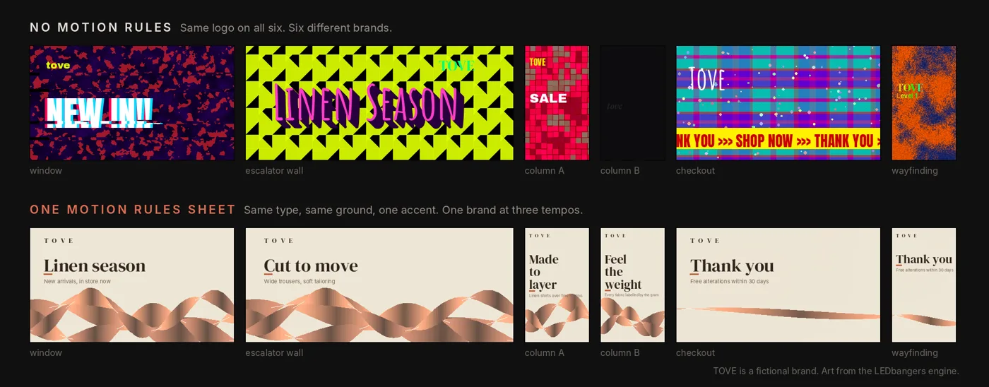
A brand manager walks a mall on a Saturday and passes six of her own screens in twenty minutes. Window display, escalator wall, two column screens, the checkout loop, a wayfinding panel near the food court. Same logo on all six. Same fonts. And still it reads like six different brands. The window is frantic. The checkout screen crawls. One column pulses red every second, the other fades so slowly you cannot tell it is moving. Nobody broke a rule, because there was no rule to break. The brand book stopped at the edge of the still frame.
This is the gap Episode 5 closes. We have already said two things in this series that quietly change everything: screens have jobs (Episode 2), and loops win by endurance, not novelty (Episode 4). Now the next layer. Brand consistency on a screen network does not come from putting the logo on everything. It comes from turning your brand guidelines into a motion grammar, so a promo, an ambient loop, a seasonal skin, and a last-minute local upload all still feel like one brand.
The principle: a brand book stops where motion begins
Most brand books define logo usage, typography, color palette, layout grids, photography, and icon style. All of it necessary. All of it written for fixed frames, controlled reading, and predictable context, which is to say for paper and web.
Screens are a different medium. They have light, time, repetition, viewing angle, glare, distance, and an operations reality where a store manager can upload a file at 9am on a Saturday. A brand book that says nothing about time and energy leaves a vacuum, and people fill a vacuum with whatever looks cool that week. Six months later the network is a patchwork quilt and no two screens agree on what the brand sounds like.
Research on distinctive brand assets points the same way. In a 2024 study of 44 car-brand assets, logos were the most uniquely owned, while colours, fonts and slogans on their own were rarely tied to one brand; the authors put ownership down to creative execution and consistent use. A palette is not enough. Behaviour, repeated, is what a brand can own.
Two dimensions are missing from almost every guideline:
- Time. How things enter, hold, exit, and repeat.
- Energy. Tempo, rhythm, intensity, restraint.
Add rules for those two and you have a motion grammar: the set of rules that keeps motion feeling like your brand even when the content changes. Write them down in one artifact and you have a Motion Rules Sheet. Think of it as a style guide for movement.
The mechanism: motion grammar has four pillars
1. Tempo, or how your brand uses time
Tempo is not fast versus slow. Tempo is how your brand spends time: how long it holds a piece of information, how often it changes, how it transitions, how it repeats.
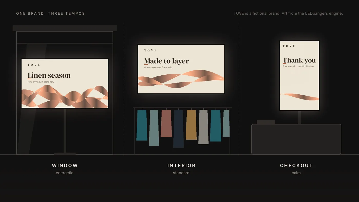
The first rule is that tempo follows the zone. The same brand should run a slightly more energetic window (attention and legibility at distance), a calmer interior (it is competing with the product, not the street), and the calmest checkout or queue (people are already stressed, do not add to it). Across all three, the tempo still has to feel like the same brand. That is the trick: variety of pace, single identity.
Pick a tempo tier for the brand, usually one, at most two. Not five.
- Calm / premium: long holds, soft transitions, minimal change.
- Standard / confident: moderate holds, clear transitions, rhythmic repetition.
- Energetic / youth: shorter holds, sharper transitions that still stop short of chaos, more pulse.
Then write the tempo down as numbers a freelancer or a template can obey:
- Minimum hold for anchor text: 2.5 to 4 seconds.
- Maximum transitions per 10 seconds: 1.
- Preferred transitions: fade, dissolve, slide.
- Easing: soft, linear, or snappy (choose).
- Loop duration range: whatever your system runs. Ours tends to sit around 8 to 12 seconds.
Tempo is the whole difference between premium and busy on identical graphics.
2. Typography behavior, because type performs on a screen
On paper, type is a layout. On a screen, type is a performance: how it appears, how it holds, how it exits, how it survives being read from an angle, at distance, by someone walking.
Most brands have typography rules. Almost none have typography behavior. It has three parts.
Hierarchy. Anchor line at most three words. Support line kept short, say five to nine words total. One case, chosen and enforced. Anchor heavier than support. Consistent spacing and margins.
Placement and safe zones. Players crop or rescale when a file does not match the screen's native size, seams cut through corner installs, and bezels and cabinet edges hide the outer pixels. Broadcast keeps graphics 5 percent in from every edge (EBU R 95); on LED walls we keep critical elements 8 to 10 percent in, and text off the edges entirely. For corner screens, mark the seam avoidance zone explicitly.
Entry, hold, and exit. Pick one enter style and one exit style for the network and hold the line. Fade, slide, or a reveal mask if the brand supports it. Scale-in reads cheap fast if overused. Then protect the hold, which is where most screen content dies: the anchor must stay stable long enough to read, roughly 2 to 3 seconds, support around 2. An energetic brand can pulse, but the words still have to be readable by someone in motion.
One rule covers all of it. If the motion makes the type harder to read, the motion is wrong. Typography is the contract between the brand and the person walking past. Break it and the screen is decoration.
3. Color behavior, beyond the palette
A palette is a list. Color behavior is a system, and screens add pressure a print palette never faced: brightness shifts perception, LED black is not OLED black, daylight rewrites everything after sunset, constant cycling causes fatigue, and uncontrolled saturation reads cheap.
Define three things.
A background strategy. Dark-base (backgrounds mostly dark, accents pop), light-base (backgrounds light, type anchored), or a controlled mixed-base that alternates on purpose, never at random. Then name the allowed background colors, when each is used by zone, and what never happens.
Accent rules. Accents are what make the system feel alive. One accent moment per loop. Accent as a pulse, not constant noise. Never more than two accents at once. If red means high signal for you, keep it for high-signal moments only.
Transition rules. The common failure is chaotic hue cycling because it looks dynamic. Do the opposite: prefer gradual shifts, cap the hue jumps, hold luminance roughly stable to cut fatigue. Treat color transitions like music, not fireworks.
Seasonal swaps live here too. Seasonal is not a new brand every month. It is a motif layer, a limited set of palette variants, a background shift, and maybe one typographic accent change. The season moves; the system stays.
4. Forbidden effects, the list that protects taste
This is where consistency becomes real and enforceable, because premium brands are defined as much by what they refuse as by what they do. Write a no-go list and hand it to everyone who touches the screens:
glitch spam, strobe flashes, wipe presets nobody chose, fake HUD overlays (unless that genuinely is your brand), 3D bevel and drop-shadow text, random particle explosions, five moving layers at once, a hard cut every second, rapid zooms and shakes.
That single list is what stops template drift, the slow slide of any network into generic digital-signage soup.
Seeing it: one real build, and the same grammar on three screens
A quick note on what this is and is not. This is not a lab result with dwell-time charts. The retail-screen industry does not have that shared data yet, and we are not going to pretend we do. What we have is a method we use on real work and a way to show you exactly what it looks like, so you can judge it with your own eyes and try it on your own screens.
Start with a real build. We made the Abstraquarium loop for Maison Concept's Designers Bazaar, and the numbers here are production facts, not audience claims. The surface is a 5 by 4 metre outdoor P3.91 LED wall running at 1280 by 1024, a 5:4 raster at about 256 pixels per metre. The delivery is a 12-second master at 60 fps, exactly 720 frames. Every animated value is derived from normalized loop time with integer-cycle periodic functions, so the loop closes on itself with no state jump. We verified that: the frame at time 0 and the frame at time 1 render byte-identical, same SHA-256, and the export drops the duplicated end frame so playback goes 719 to 0 with no inserted pause. That is Episode 4's endurance rule made literal.
The brand behavior is where it connects to this episode. Because it lives outdoors on a bright wall, the color behavior is written into the render, not left to chance: restrained pure-white usage, capped color channels, gradual movement, no flashes, no abrupt cuts, no single-frame events. That is a forbidden-effects list and a color-transition rule enforced in code. The source version carried a whole layer of letters, numerals, and symbol glyphs; we removed it so the piece reads cleanly at distance and never fights a real headline for attention. Delivery is mastered to Rec.709 with a house order of ProRes 422 HQ first, then a broadly compatible H.264, with the actual file tested on the venue's LED processor before show day, because processor compatibility beats theoretical codec quality every time.
None of that came from taste on the day. It came from rules decided once and applied. That is the whole argument for a Motion Rules Sheet.
For the rest, we show, not tell. Below is one brand run at three tempos across three zones: the window, the interior wall and the checkout. Watch a single identity hold while the pace changes. The brand, TOVE, a linen label, is fictional, and every frame is made in our studio, the same way we make client work. It is an illustration of the method, not a photo of a finished install, and it is labelled as such. The point is to make the grammar visible before you commit a network to it.
The deliverable: your Motion Rules Sheet
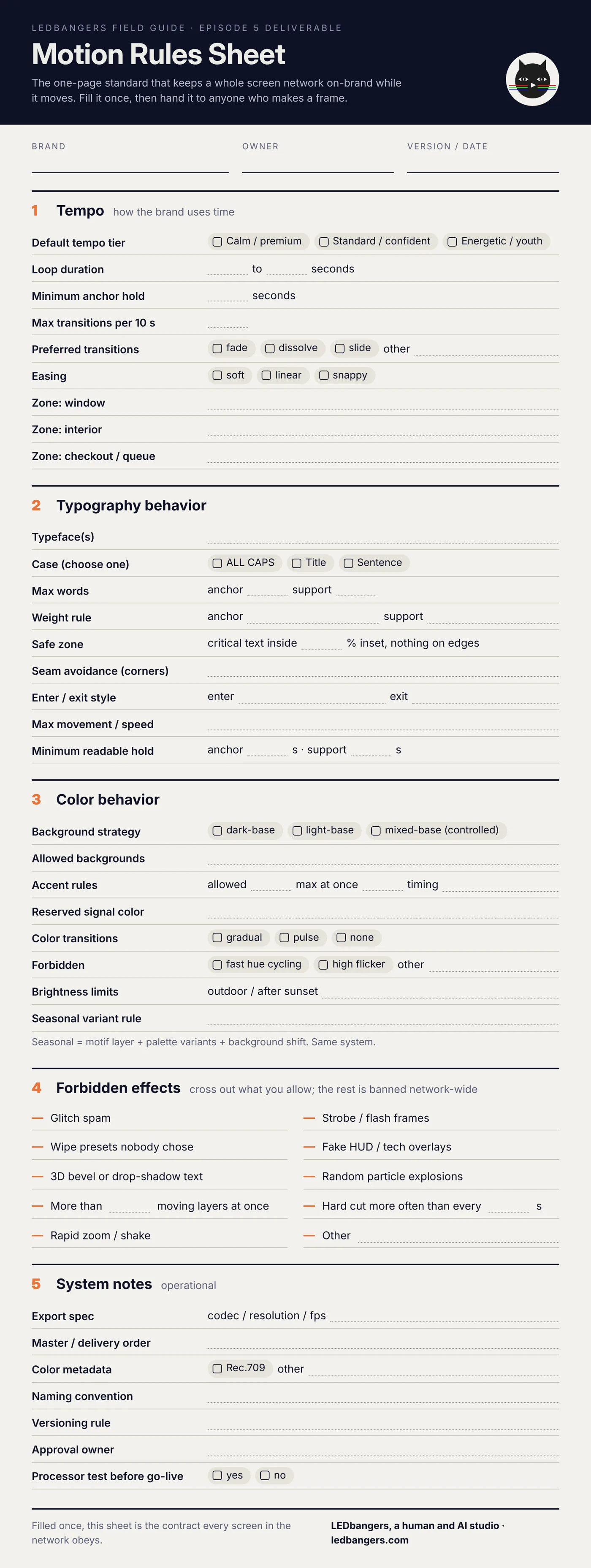
Every episode in this series ships something you can use the same day. This one is the Motion Rules Sheet, a one-page fillable standard covering tempo, typography behavior, color behavior, forbidden effects, and the operational notes (export spec, naming, versioning, approval owner) that keep a network from drifting. Fill it once for your brand and hand it to anyone who makes a frame.
The blank sheet is below. Save it and fill it in. If you want it filled for your specific screens, start a brief at ledbangers.com and we will do the first pass with you.
One thing to keep
Brand consistency on screens is not the logo. It is rhythm, pace, and behavior written down as rules a template can obey.
Next episode
Episode 6, window versus interior: why the same brand needs two different jobs on the glass and inside the store, and how to write content for each without splitting into two brands.
If you want the field guide as it ships, plus the deliverable from every episode, follow LEDbangers. If your screens already feel like a patchwork quilt, start a brief at ledbangers.com and we will map your motion grammar.
LEDbangers is a human and AI studio making code-first motion for retail LED and OLED screens. This episode was researched and written with AI, built on our own research base and on interviews with Burcin Inan Ozel, who reviewed and edited every line. The figures are made in the studio the same way. Poma and Luma are the two cats who argue in the margins: instinct and structure, the two halves of every good screen.
Sources: graphics-safe margins, EBU R 95; distinctive brand assets, Fiocchi and Seyed Esfahani, Journal of Brand Management 31 (2024).