Field Guide EP 04
Loop design 101: why a loop with no seam beats viral
Season 1, Episode 4 of the retail screen field guide.
Watch the episodePDF: Loop design sheet
We're LEDbangers. We design motion for LED/OLED screens that live in real places: stores, streets, façades, lobbies, counters and spaces where content runs for hours and gets seen in fragments.
This episode is where we say the quiet part out loud:
Retail screens don't reward novelty the way the internet does. Retail screens reward endurance.
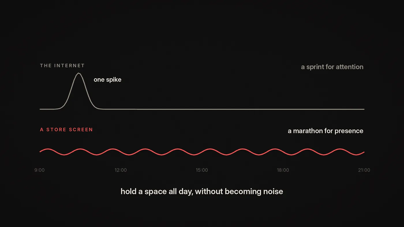
If social media is a sprint for attention, in-store screens are a marathon for presence. The screen isn't trying to win a single moment. It's trying to hold a space all day without becoming noise.
That's why "seamless" beats "viral."
A quick reality check: what "viral" optimizes for
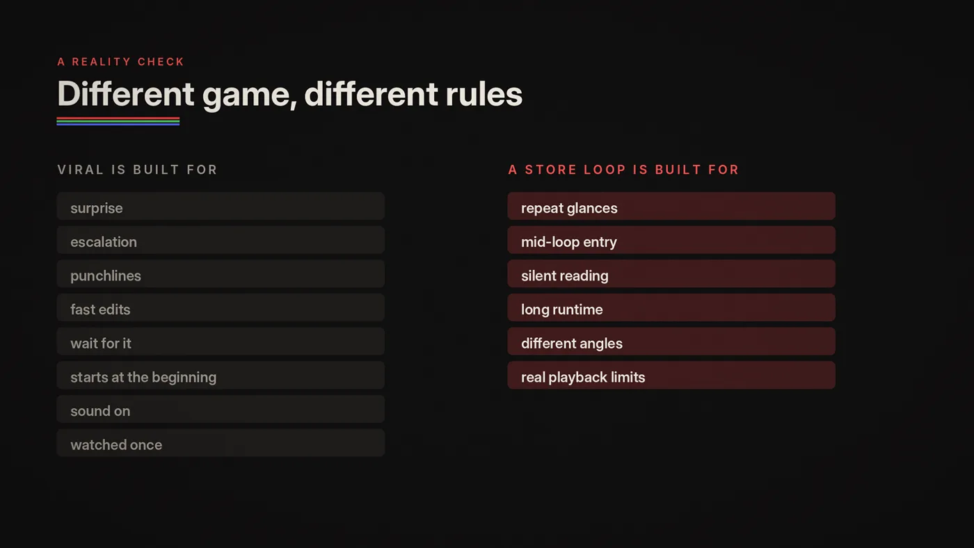
Viral content is optimized for:
- surprise
- escalation
- punchlines
- fast edits
- "wait for it"
- the viewer starting at the beginning
- the viewer having sound (or at least intent)
Most viral videos are built to be watched once, from the start.
But a store loop is designed for:
- repeat glances
- people entering mid-loop
- silent-first reading
- long runtime
- visual fatigue resistance
- different angles and distances
- real-world playback constraints
Different game. Different rules.
The moment you try to run "viral" logic on a store screen, you get:
- frantic edits that become stress
- content that feels cheap long before closing time
- endless "what are we even showing?" moments mid-loop
And you lose the real value of screens: consistent brand presence.

What a loop really is
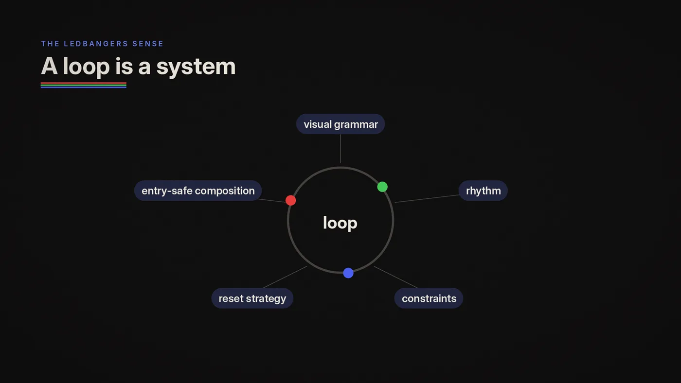
A loop is not just "a video that repeats." A loop is a system:
- a visual grammar
- a rhythm
- a set of constraints
- a reset strategy
- an entry-safe composition
A strong loop behaves like a chorus:
- it's recognizable
- it repeats without tiring
- it carries the identity
- it stays legible even if you join late
When loops are built as systems, you can produce variations without chaos. You can scale them across ratios. You can adapt them seasonally. You can keep a network coherent without constant reinvention.
That's the point.
The three loop truths
Truth 1: People enter mid-loop
Your "beginning" is a fantasy. Design for random entry.
Truth 2: Most viewing is a glance
People don't stare. They glance. They absorb. They return.
Truth 3: Repetition is the mechanism
The loop isn't trying to win one moment. It's trying to land over time.
Up to a point. Advertising research finds that liking usually rises over the first few exposures and then turns to irritation. That is why a good loop varies inside a fixed grammar instead of repeating one file forever.
If you accept these truths, your design decisions get cleaner instantly.
The loop archetypes
Every good loop tends to fall into a recognizable archetype. Archetypes are not limitations. They're reliable structures that survive repetition.
Here are the core loop archetypes we use most in retail and public spaces.
1) Drift loop (the atmospheric one)
Behavior: slow movement across a stable composition. Best for: ambient mood, premium spaces, interior walls, lounges, window backgrounds. Why it works: minimal fatigue. It feels like the space is breathing.
Design rules:
- keep the anchor stable (if there is one)
- let motion live in texture, not in layout
- avoid high-contrast flicker
- use long cycles (we use 8 to 20 seconds)
Common mistake: drift that becomes "screensaver generic." Fix: embed brand DNA: palette behavior, type behavior, motif language.
2) Pulse loop (the rhythmic one)
Behavior: the composition holds, then "pulses" with a repeated event (a reveal, a flash, a shift). Best for: window messaging, category clarity, gentle promos. Why it works: repetition with structure. People learn it fast.
Design rules:
- the pulse should be predictable, not chaotic
- keep time between pulses consistent
- don't make the pulse too bright (fatigue)
- ensure the anchor is readable before and after the pulse
Common mistake: pulse becomes strobe. That is a safety issue, not only a taste issue: never more than three flashes in any one second. Fix: slow it down, soften transitions, reduce contrast jumps.
3) Cycle loop (the rotating states one)
Behavior: the loop moves through a small set of states (A → B → C → A). Best for: multi-message systems without chaos, multi-language, seasonal variants. Why it works: it allows variety while staying learnable.
Design rules:
- limit states (2–4 in our practice)
- keep layout stable across states
- ensure each state is entry-safe
- use consistent transition style
Common mistake: too many states creates a slideshow. Fix: reduce to the few that matter; increase time per state.
4) Reveal loop (the "arriving" one)
Behavior: something gradually forms, appears or assembles, then dissolves back. Best for: brand markers, logos, signature motifs, "crafted" feel. Why it works: it feels intentional and premium, when done calmly.
Design rules:
- do not hide meaning until the end
- keep an anchor visible early
- let the reveal be a texture event, not a plot twist
- ensure the loop can be joined at any phase
Common mistake: reveal is too slow or too dependent on "the final frame." Fix: show partial meaning early; repeat the key mark more often.
5) Conveyor loop (the directional one)
Behavior: content moves in a consistent direction: left-to-right, up-to-down, around a corner. Best for: corner screens, wayfinding, retail canopies, repeated phrases. Why it works: directionality feels like flow; it matches movement in space.
Design rules:
- consistent speed
- minimal text
- high legibility from angles
- safe zones for seams/edges
Common mistake: speed too fast makes it unreadable. Fix: slow the conveyor; increase type weight; reduce words.
6) Field loop (the generative system one)
Behavior: a code-based field generates variation within rules: never identical, never chaotic. Best for: ambient identity, flagship walls, long-run networks, seasonal skins. Why it works: it can run forever without repeating exactly, while staying on-brand.
Design rules:
- variation must stay inside a brand grammar
- avoid "random everything"
- keep luminance stable
- ensure entry-safe anchors if text is involved
Common mistake: generative becomes "art demo" instead of retail-native. Fix: constrain palette, constrain motion, constrain density.
Reset design: where loops live or die
Most "bad loops" aren't bad because the content is ugly. They're bad because the reset feels like a mistake.
Resets matter because:
- they happen all day
- they train your staff and customers to either trust the screen or ignore it
- a sloppy reset makes the whole thing feel cheap
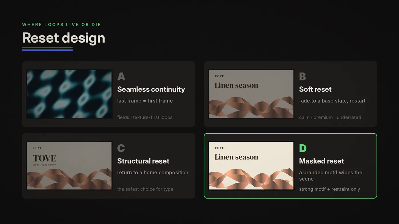
There are four reset strategies that work in retail.
Reset strategy A: Seamless continuity
The end frame matches the beginning frame perfectly. Use when you have a stable field or pattern system, the loop is texture-first, and you want "infinite" motion. Warning: a perfect seam can be hard with camera footage. For generative or designed loops, it's easier.
Reset strategy B: Soft reset (fade/dissolve)
The loop ends with a fade to a base state, then restarts. Use when you want calm premium rhythm, exact seam matching is overkill, or the environment is already visually busy.
Soft reset is underrated. It often feels more intentional than forcing a perfect seam.
Reset strategy C: Structural reset (return to anchor)
The loop resolves by returning to a stable "home" composition, like a chorus returning. Use when you have messages or typography, you want entry-safe stability, and you want to avoid a "glitchy restart."
This is one of the safest methods for retail messaging loops.
Reset strategy D: Masked reset (wipe via design logic)
A shape, pattern, or motif wipes the scene in a branded way. Use when your brand has a strong graphic motif and you want visible transitions without cheapness. Warning: most wipes look cheap. Use restraint and consistency.
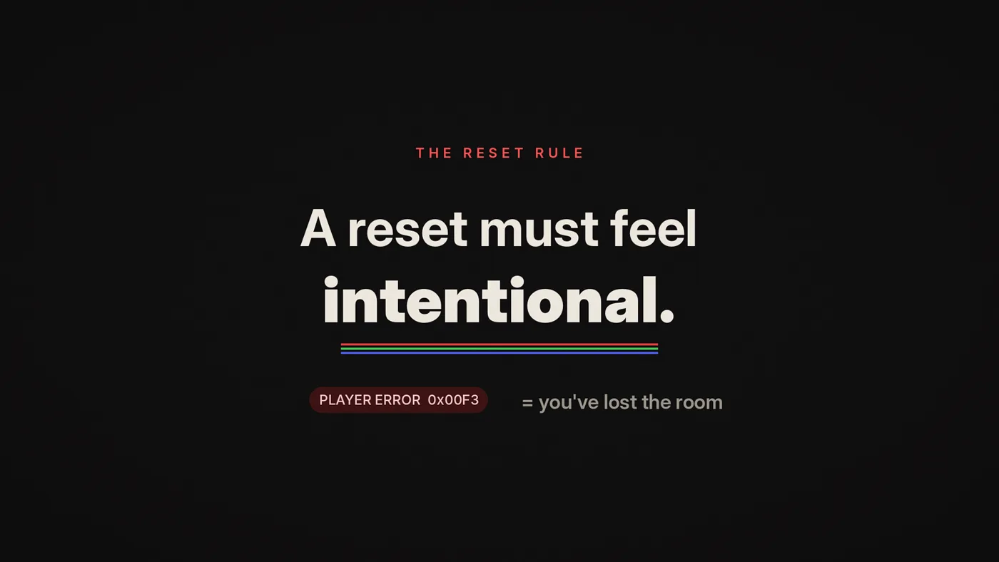
The reset rule
A reset must feel intentional. If it feels like a player error, you've lost the room.
Fatigue avoidance: the part nobody plans for
The internet rarely asks: "Can I watch this 1,800 times?" Retail does. A 20-second loop plays 1,800 times in a 10-hour trading day.
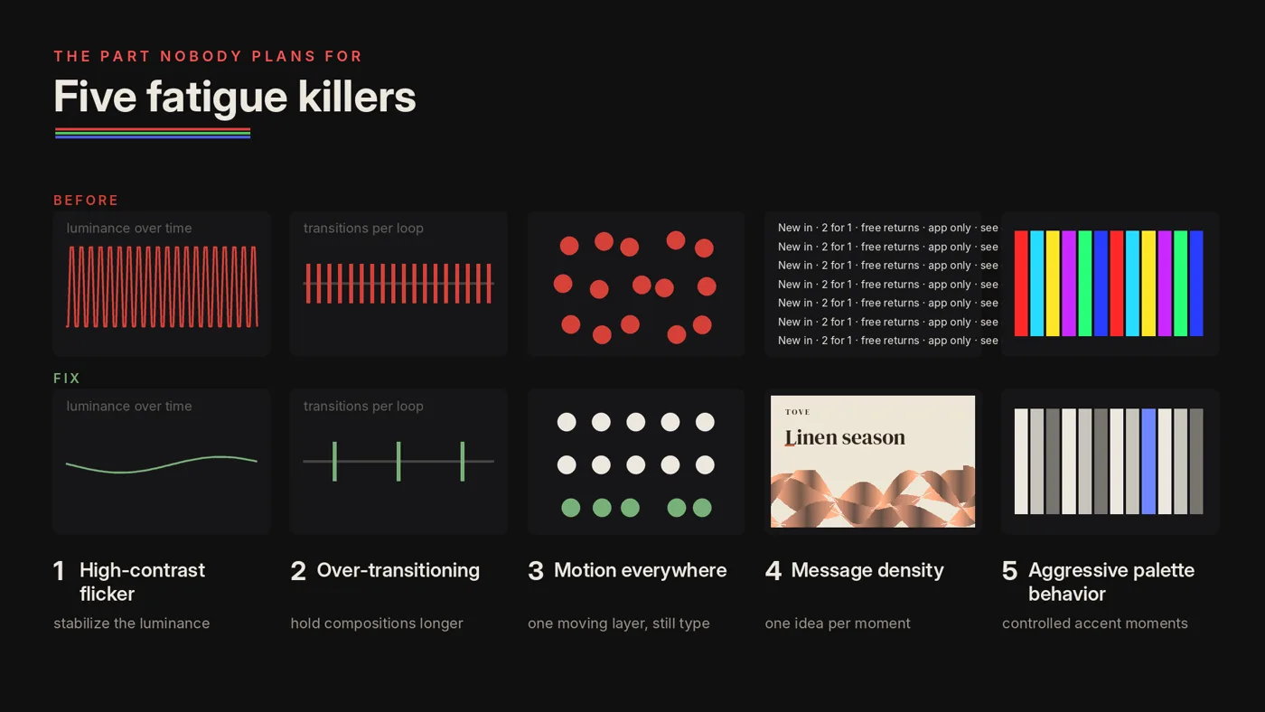
Fatigue is what makes screens turn into noise. It's what makes staff complain. It's what makes customers tune out. Here are the core fatigue killers and how to avoid them.
Fatigue killer 1: High-contrast flicker
Rapid alternation between bright and dark frames is tiring at best. At more than three flashes a second it can trigger seizures in people with photosensitive epilepsy, and a large, bright LED wall fills more of the view than a TV, which makes it worse. Regular stripes need care too: broadcast rules flag patterns of more than five light and dark pairs that flash or reverse across a quarter of the screen. A smooth drift in one direction is fine.
Fix: stabilize luminance, no more than three flashes in any one second, prefer slow contrast changes.
Fatigue killer 2: Over-transitioning
If the screen is constantly changing, the brain can't rest.
Fix: hold compositions longer, reduce transition count, use calmer easing.
Fatigue killer 3: Too much motion everywhere
When everything moves, the space feels anxious.
Fix: pick one dominant moving layer, keep typography stable, let texture carry motion.
Fatigue killer 4: Over-message density
Screens that try to say too much become a constant demand.
Fix: one idea per loop moment, anchor + support only, move details elsewhere.
Fatigue killer 5: Aggressive palette behavior
Some brands love loud color, but loud doesn't need to mean exhausting.
Fix: design a palette behavior rule, avoid chaotic hue cycling, use controlled accent moments.
The endurance test
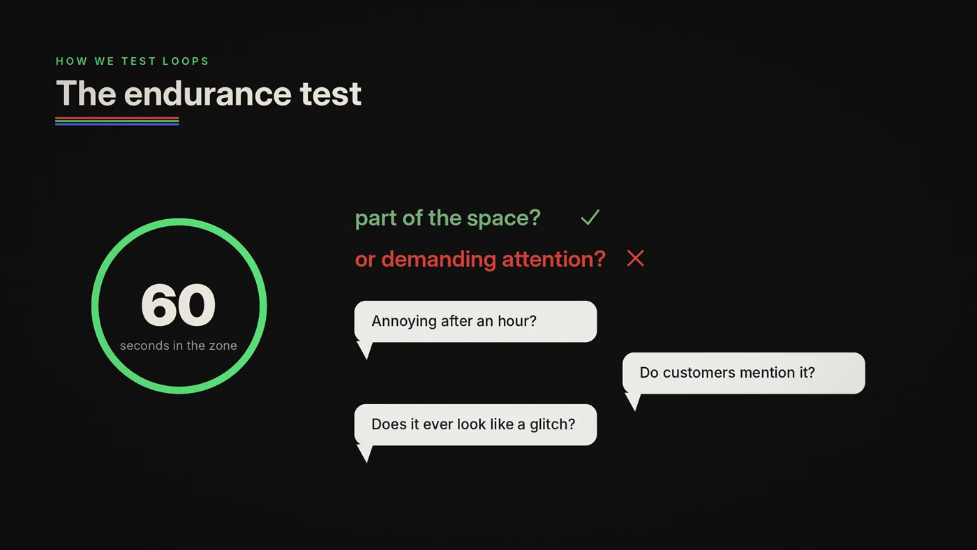
We do something simple on-site:
- Stand in the zone for 60 seconds
- Watch what your eyes do naturally
- Ask: does the screen feel like part of the space or does it demand attention?
Then we ask staff:
- "After one hour, does this annoy you?"
- "Do customers ask about it positively or ignore it?"
- "Does it ever feel like it's glitching?"
How to choose the right archetype
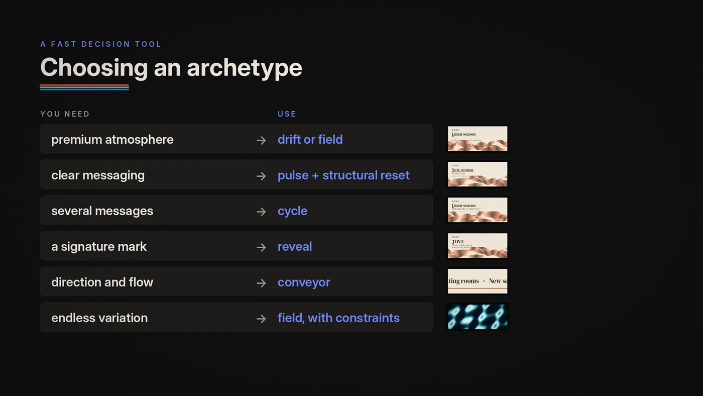
Use this as a quick selector:
- Need premium atmosphere? → Drift / Field
- Need clear messaging? → Pulse / Structural reset
- Need multiple messages without chaos? → Cycle
- Need brand signature reveal? → Reveal
- Need direction and flow? → Conveyor
- Need infinite variation? → Field (with constraints)
Don't start with effects. Start with archetype and zone job.
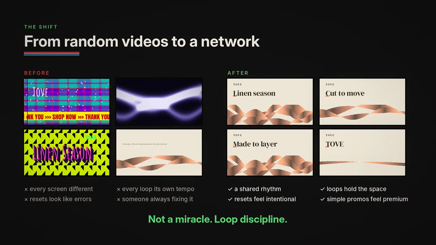
Mini story: the moment a network stops feeling like "random videos"
You can feel it when it happens.
Before: every screen is different, every loop has a different tempo, resets feel like playback errors, someone is always "fixing the content."
After: screens share a rhythm language, loops hold the space instead of attacking it, resets feel intentional, even simple promos feel premium, the store feels designed.
That shift is not a miracle. It's loop discipline.
Deliverable: loop archetypes, reset rules and fatigue checklist
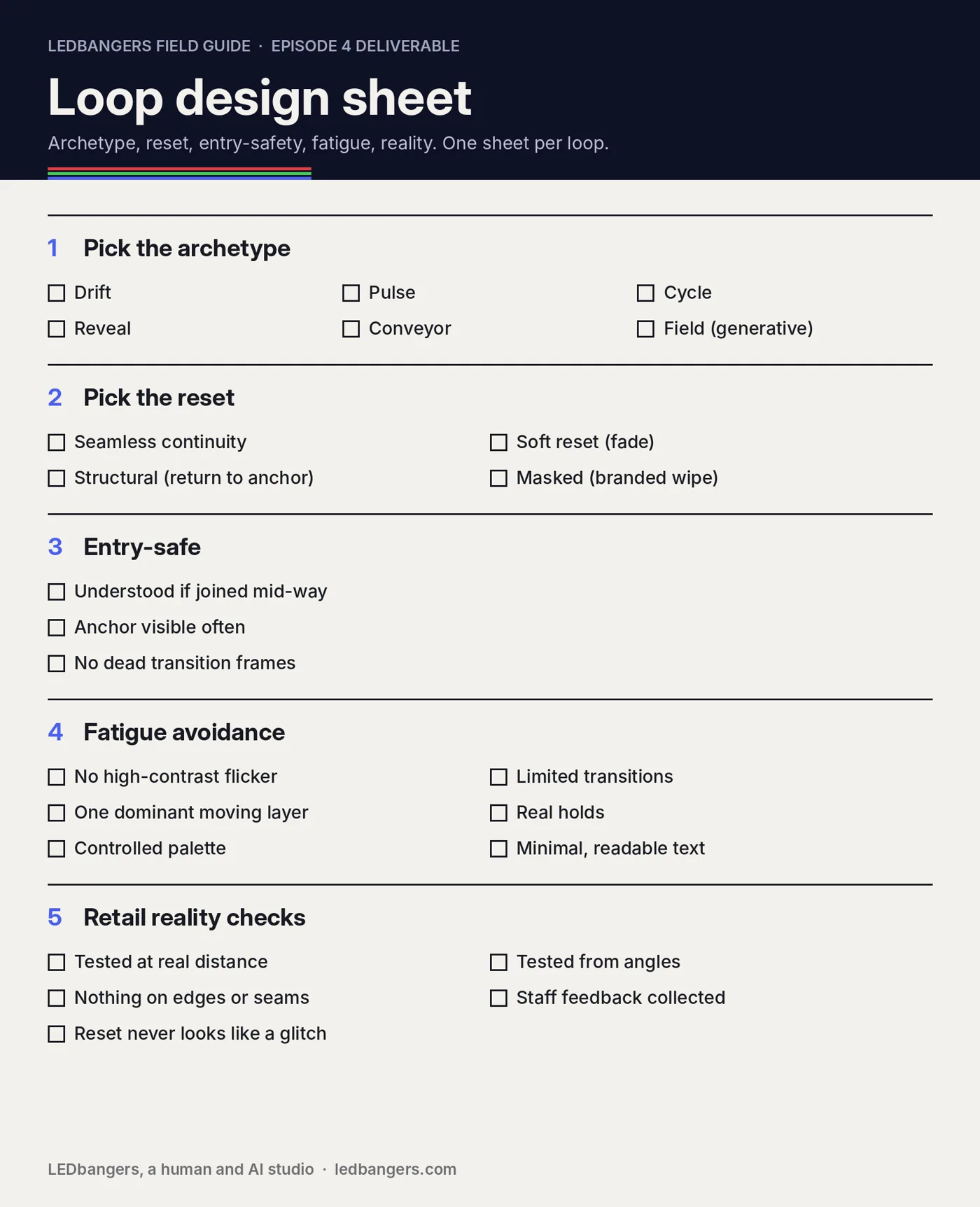
- Pick your archetype: drift, pulse, cycle, reveal, conveyor, field (generative).
- Pick your reset strategy: seamless continuity, soft reset, structural reset, masked reset.
- Entry-safe rules: can the loop be understood if someone joins mid-way? Is the anchor visible frequently? Are there "dead frames" that only transition?
- Fatigue avoidance: no high-contrast flicker, limited transitions, one dominant motion layer, stable hold times, controlled palette behavior, minimal readable text.
- Retail reality checks: tested at real distance and from angles, key content away from edges and seams, staff feedback collected, reset feels intentional.
A small Poma and Luma margin note

What to remember
Viral content wins by novelty. Retail loops win by endurance.
Novelty fades in stores too. In a 2016 field study, the sales lift from new in-store screens shrank over five months, even in the large stores where it worked best.
If you want screens that feel premium, coherent, and worth the electricity they consume, stop asking "what video should we play?" and start asking:
What loop system should this screen run, so it can repeat all day and still feel like the brand?
Next episode: brand consistency on screens, and how brand guidelines become motion rules.
Sources: W3C, WCAG 2.2, success criterion 2.3.1 Three flashes or below threshold; Ofcom, Guidance note on flashing images and regular patterns in television; Kronrod and Huber, "Ad wearout wearout", International Journal of Research in Marketing 36, 2019; Roggeveen, Nordfalt and Grewal, "Do digital displays enhance sales? Role of retail format and message content", Journal of Retailing 92(1), 2016.