Field Guide EP 01
Hello, World
Season 1, Episode 1 of the retail screen field guide.
We are LEDbangers.

A creative studio built for LED/OLED screens. Because screens in real spaces don't behave like screens on the internet. They glare. They reflect. They get seen from angles. They live next to products, people, daylight, and architecture. They run for hours, not seconds. And they either become a living part of the brand or expensive noise.
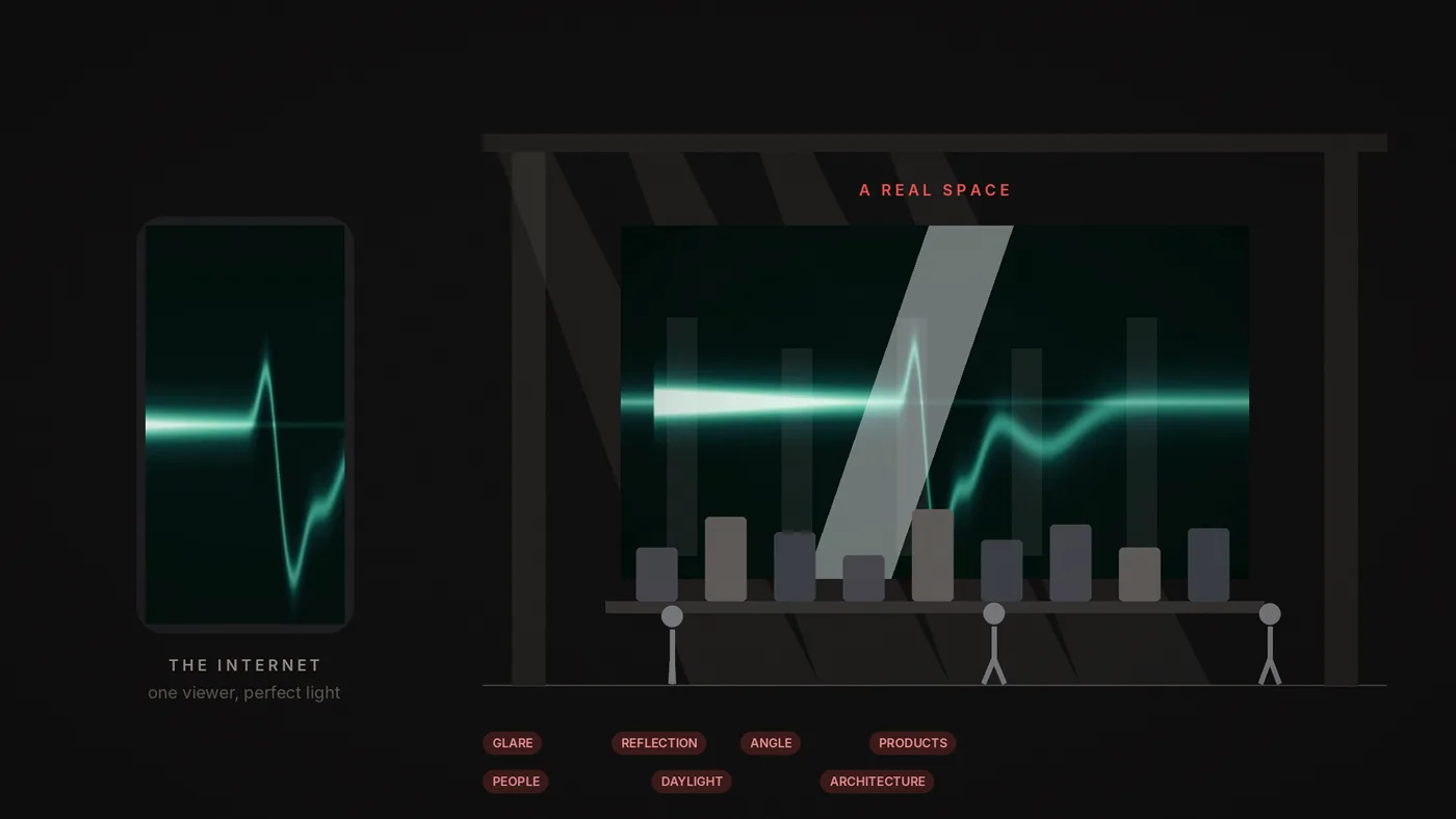
LEDbangers exists for the first outcome.
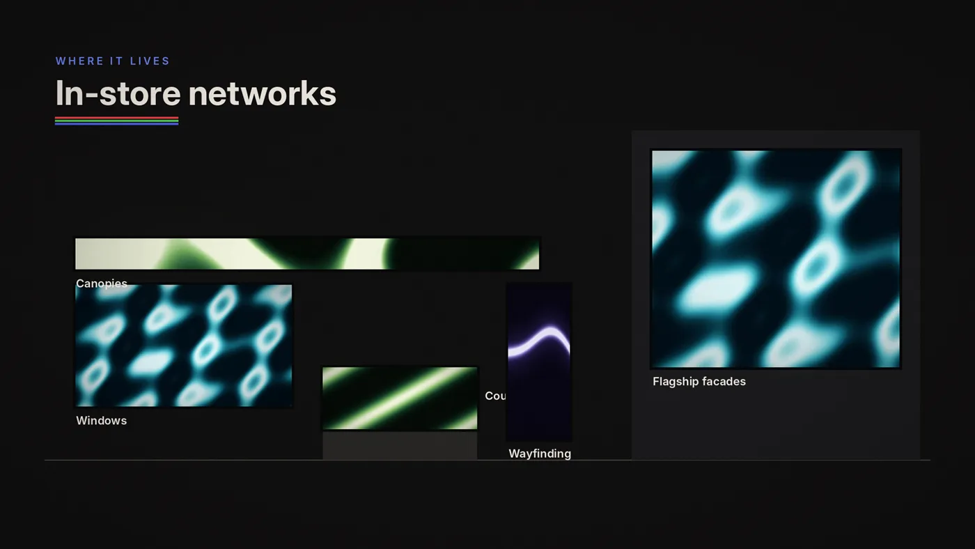
We design code-generated motion for screens (programmable visuals, ambient loops, and interactive moments) made to live on in-store networks: windows, canopies, counters, wayfinding zones and flagship façades. And when the same rules apply outside retail, we go there too. One screen or a citywide network, the work should keep its soul.
Why we were founded
Not because brands lack creativity but because the content wasn't made for the environment it ends up in. A campaign video gets resized. A social edit gets thrown onto a signage player. A playlist gets filled with whatever exists. The result looks "busy," "random," or "cheap," even when the brand isn't.
So we started from a different premise:
A screen is not a box for media. A screen is a living canvas with constraints.
Constraints are not the enemy. Constraints are the material.
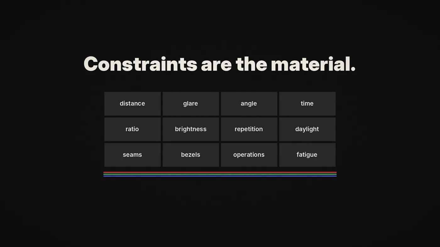

And if you treat that material seriously, if you design motion as a system instead of a one-off, screens stop being a headache and start behaving like a brand asset.
The name behind the studio
LEDbangers was founded by multidisciplinary artist Burcin Inan Ozel, also known as Burcin IO.
This studio grows out of that practice: computational art, design discipline, motion systems, and the kind of hands-on building that doesn't end when a concept looks good on a laptop. Because retail screens don't live on laptops. They live in places that require visual durability, technical durability, operational durability.
We identify this brand in a cat logo because; c'mon, we're İstanbul based, what else it could be :)
This studio brings code-based art and branding together where we're mixing two disciplines in a pot. Our original logo image represents our art persona while the inverse logo image represents the branding persona.
- The art persona: instinct, rhythm, aesthetic risk, atmosphere, texture, surprise.
- The branding persona: structure, clarity, repeatability, scalability.
When those two modes collaborate, screens stop looking like generic signage and start looking like a brand with a pulse.

What we believe
We believe retail motion should be minimal, rhythmic, and brand-true.
We believe a screen system should be designed to run for long hours without visual fatigue, because the store doesn't end after 15 seconds.
We believe the best retail motion is not "viral." It's not begging for attention. It's confident enough to repeat. It belongs.
We believe code is not just a production trick. Code is a way to build visual intelligence: variation without chaos, identity without sameness, speed without sacrificing craft.
We believe a screen is not an afterthought. It's a front door. It's a guide. It's a mood-setter. It's sometimes the loudest thing in the room, so it should be designed with responsibility.
What we make
LEDbangers creates brand-native motion sets and code-based creative solutions for LED/OLED screens, especially in retail spaces, and beyond retail whenever the project calls for it.
Our work usually lands in one (or a mix) of these four formats:
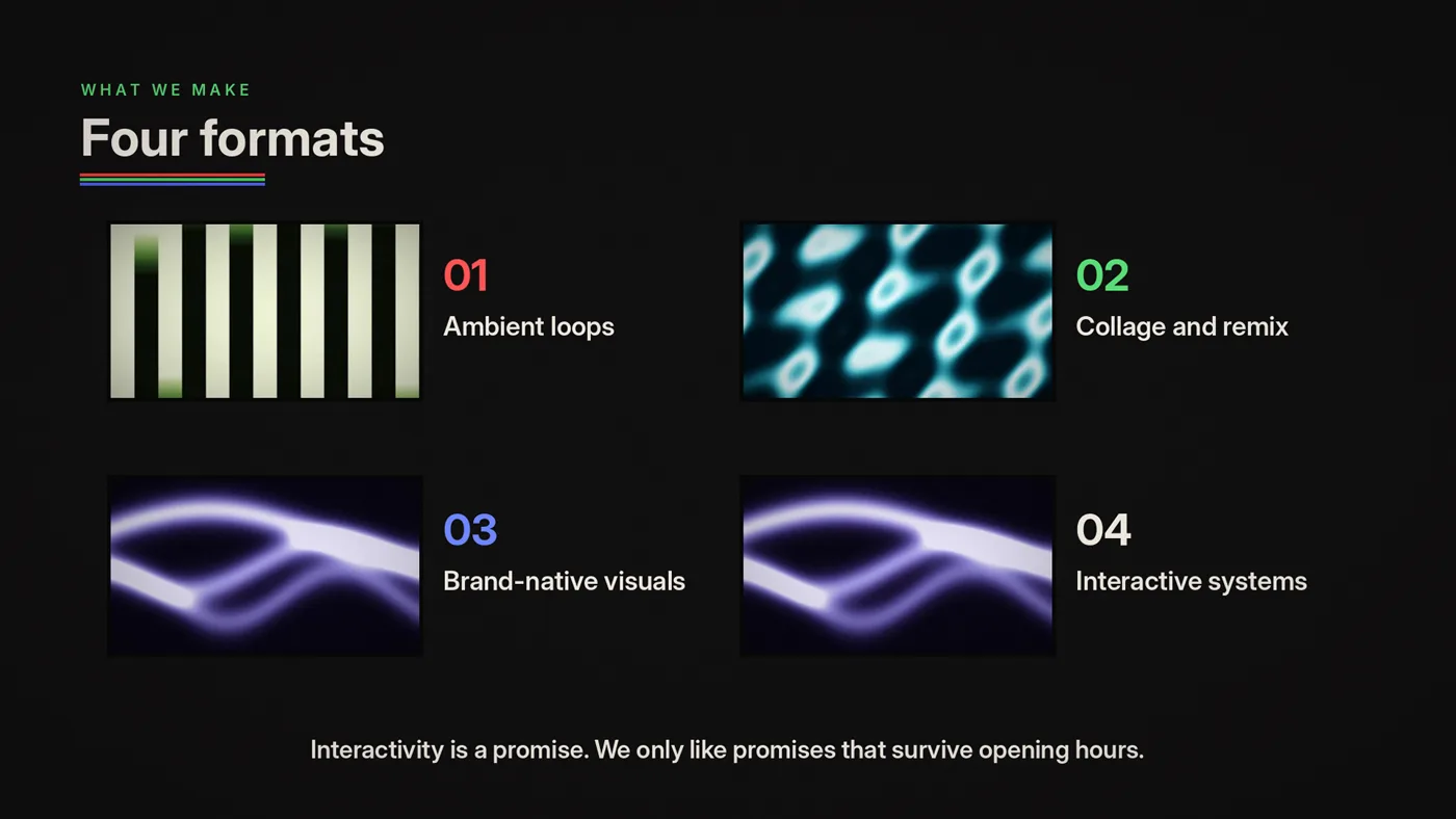
1) Ambient loop contents
Seamless, minimal loops built with generative code, designed to sit behind product, windows, counters, and canopy strips without visual noise.

These are the always-on layer that makes a store feel designed even on non-campaign days: seasonal ambience, kinetic textures, subtle typographic rhythms, color washes that feel like the brand. These ready-to-collage loops come in various resolutions and color options for marketing and content teams to add their layers on top of. See the catalog of ready-to-collage loops in the Loop library.
2) Content collage and remixes
We transform existing footage and UGC into brand-consistent motion systems where scripts can auto-playlist, frame, caption, blend, and overlay content with a graphic language that stays coherent.
This is how brands stop "throwing videos onto screens" and start running a controlled visual identity fast.
3) Brand-native visuals
A motion identity derived from the brand's DNA: grids, rhythm, color behavior, logo behavior, typography animation, transitions packaged to work across real retail ratios.

This is where screen networks become unified. Where "this could only be us" starts to appear on every wall.
4) Interactive systems
Sensor and data-responsive experiences for flagship and hero zones: proximity triggers, touchless gestures, simple pads, counters, product triggers, time-of-day states built as robust installations.
Interactivity is a promise. We only like promises that can survive opening hours.
How we work (without the chaos)
A studio can have taste and still be impossible to operate with. We refuse that.
Our workflow is built to keep things moving without losing craft:
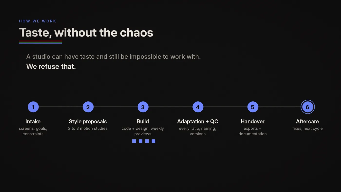
- Screen and goal intake: inventory, objectives, constraints
- Style proposals: 2-3 motion studies that set direction
- Build: code and design with short weekly previews
- Adaptation and QC: all ratios, naming and versioning
- Handover: exports and documentation, with optional templates
- Aftercare: minor fixes and next-cycle planning
Our quality standards (the unsexy backbone)
We hold ourselves to practical standards, because "beautiful" isn't enough if the network can't keep it alive:
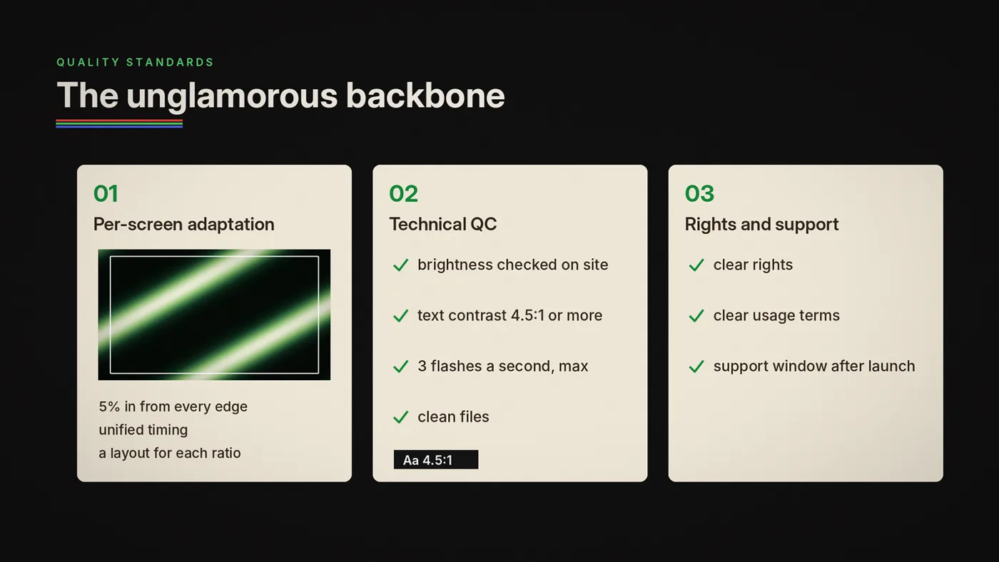
- per-screen adaptation (critical content at least 5% in from every edge, unified timing, a layout for each ratio)
- technical QC (brightness checked on site, text contrast of at least 4.5:1, never more than three flashes a second, file hygiene)
- clear rights and usage terms
- a short post-launch support window to ensure deployment is clean
The goal is elegant motion that is operationally real.
Where we are
We're based in Istanbul, working across Turkey and globally.
We like Istanbul because it's a city of layers: history next to neon, craft next to chaos, luxury next to street. It's a good place to build a studio obsessed with screens because screens are also layers: light, rhythm, message, mood, identity.
What this blog is going to be
This post is the hello world.
Next, we'll publish what most screen networks never get: a clear language for how to think about retail LED/OLED screens without turning it into a dry manual.
Some posts will be practical. Some will be visual. Some will be opinionated. Sometimes you'll hear the two internal personas argue (art instinct vs brand discipline) because that tension is exactly where the best screen work lives.
If you're curious about screens as a medium, stay close. If you're responsible for screens in the real world, even better.
LEDbangers is here to make screen-native motion feel inevitable.
Sources: EBU R 95, Safe areas for 16:9 television production; W3C, WCAG 2.2, success criterion 1.4.3 Contrast (minimum); W3C, WCAG 2.2, success criterion 2.3.1 Three flashes or below threshold.