Field Guide EP 02
What in-store LED screens are actually for (and what they're not)
Season 1, Episode 2 of the retail screen field guide.
Watch the episodePDF: 6 Screen Jobs checklist
We're LEDbangers. We build motion for LED/OLED screens the way architects think about space: with constraints, zones, and behavior, not with a folder full of random videos.
This episode is the moment we set the foundation. Because if you don't define what a screen is for, you don't have a screen program. You have a file graveyard. And sooner or later someone says:
Just play something.
That's how expensive screens become expensive noise.
A short scene you've probably lived
You're walking past a store window. The screen is bright. It's playing… something. A campaign edit, maybe. Or an animation with too much text. Or a fast-cut montage.
You don't stop. You don't understand it. You don't hate it either.
You forget it instantly.
Inside the store, another screen plays something else. Different style. Different tone. Different colors. A third screen has a loop that resets like a glitch. A fourth screen has a tiny line of text that no human can read unless they hug the wall.
The brand isn't "bad." The content isn't necessarily "bad."
But the system is missing one thing: purpose.
In-store screens can do real work. They can shape flow, reduce uncertainty, increase dwell time, and elevate perception. But only when each screen has a job, and when the content is designed for that job.
The core idea: TV logic breaks retail
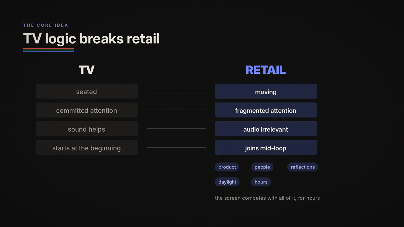
Most screen strategies fail because they're built with TV or social media assumptions.
TV assumes:
- viewers are seated
- attention is committed
- audio helps
- stories can unfold over time
- the viewer started at the beginning
Retail assumes the opposite:
- viewers are moving
- attention is fragmented
- audio is usually irrelevant
- people join mid-loop
- the screen competes with product, people, reflections, daylight, and architecture
- the screen runs for hours, not seconds
So when brands "repurpose" content into retail, it often becomes unreadable, stressful, or meaningless.
Retail screens need a different mindset:
A screen is not a container for media. It's a tool inside a space.
And tools need jobs.

The 6 Screen Jobs framework
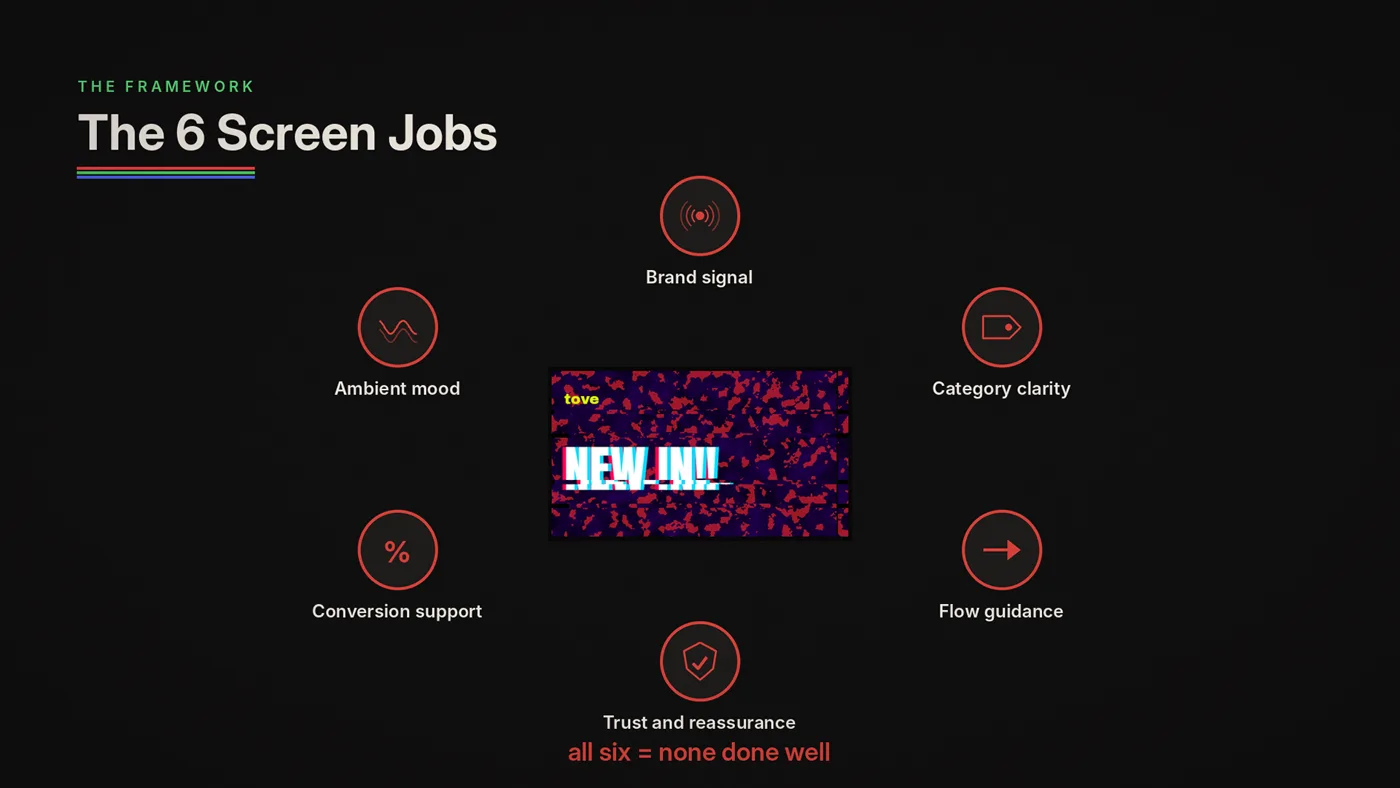
Here's the framework we use when we walk into a store. It works for one screen or a network. It applies to fashion, pharmacy, beauty, electronics and food alike, because the jobs come from how people move through a store, not from the category. How much each job pays off depends on the format.
Most screens should do one primary job and maybe one secondary job. When a screen tries to do all six jobs at once, it usually does zero jobs well.
Job 1: Brand signal
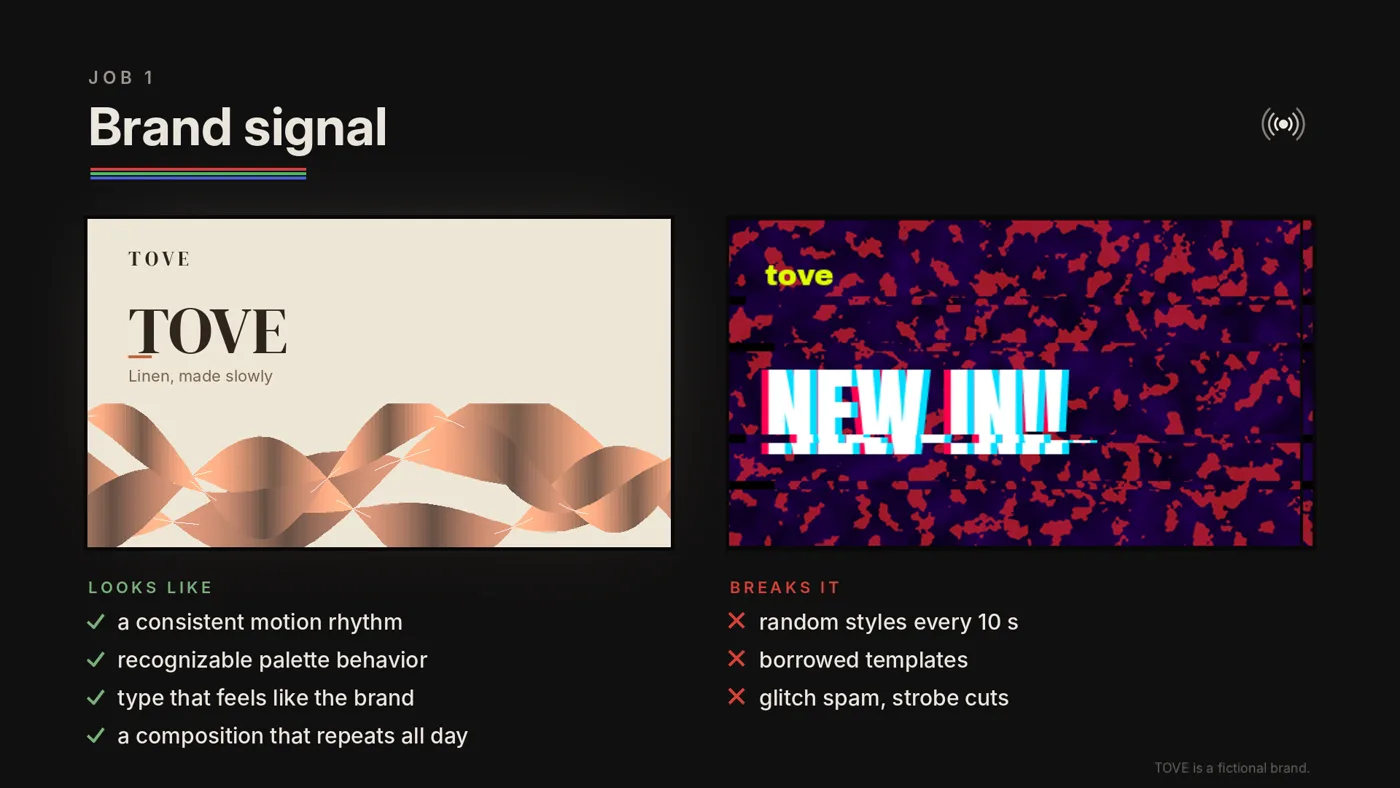
Make the brand feel present in under five seconds.
This is not "show the logo constantly." It's deeper: it's how the screen moves, how it breathes, how it holds attention without yelling.
Brand signal answers:
- What kind of place is this?
- What's the tone: premium, playful, clinical, street, minimal?
- Does this feel intentional?
What it looks like in practice
- a consistent motion rhythm
- a recognizable palette behavior
- typography that feels like the brand (scale, weight, spacing)
- a stable composition that can repeat all day
What breaks it
- random styles every 10 seconds
- borrowed templates that scream "generic signage"
- motion that's too aggressive for the brand
- effects that cheapen the vibe (overdone wipes, glitch spam, strobe cuts)
Brand signal is the "always-on" layer. Even when you're not running promotions, the screen should still say:
this is us.
Job 2: Category clarity
Communicate what you sell without explaining.
A store window has one brutal question to answer:
"What is this place?"
Category clarity answers:
- What category am I stepping into?
- Is this relevant to me?
- What's inside, in one glance?
What it looks like
- one strong phrase ("New Season", "Skincare", "Performance Running")
- one product silhouette or hero shape
- a simple visual code repeated (iconography, pattern, palette)
What breaks it
- trying to show too many products at once
- long descriptive copy
- dense grids that look like ads, not identity
- content that assumes insider knowledge
Category clarity is how you stop being "just another store with screens" and become instantly legible from the street.
Job 3: Flow guidance
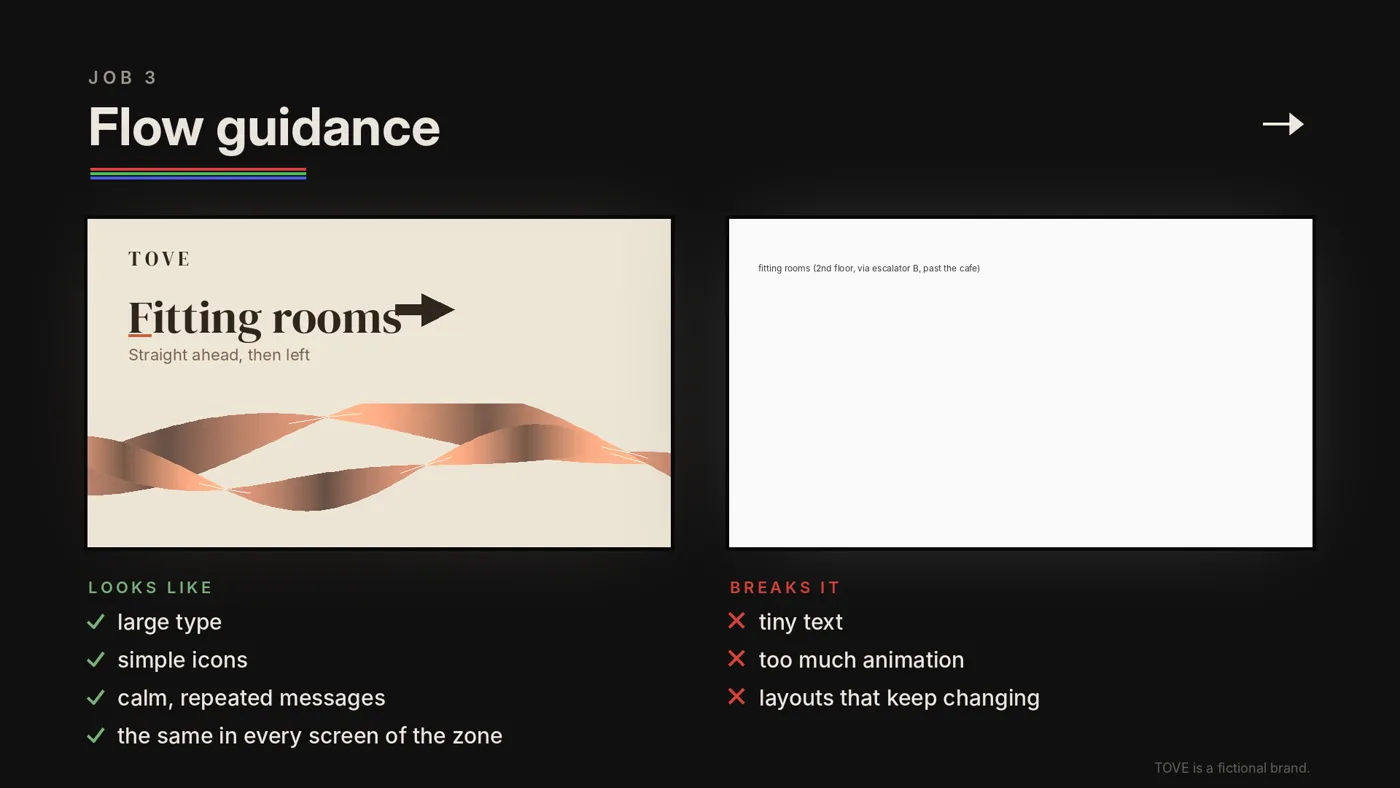
Help people move through the space without friction.
Screens can do the job signage fails to do when layouts change, campaigns rotate, or stores get busy.
Flow guidance answers:
- Where do I go next?
- Where is checkout?
- Where is service / consultation / pick-up?
- What section is this?
What it looks like
- directional cues ("Checkout →", "New arrivals upstairs")
- calm repeated messages
- large type and simple icons
- consistency across all screens in the zone
What breaks it
- overly "designed" direction signs that become decorative
- tiny text
- too much animation (direction must feel stable)
- constantly changing layouts (people can't learn it)
Flow guidance is not glamorous. It's powerful. If you reduce confusion, you make the store easier to shop.
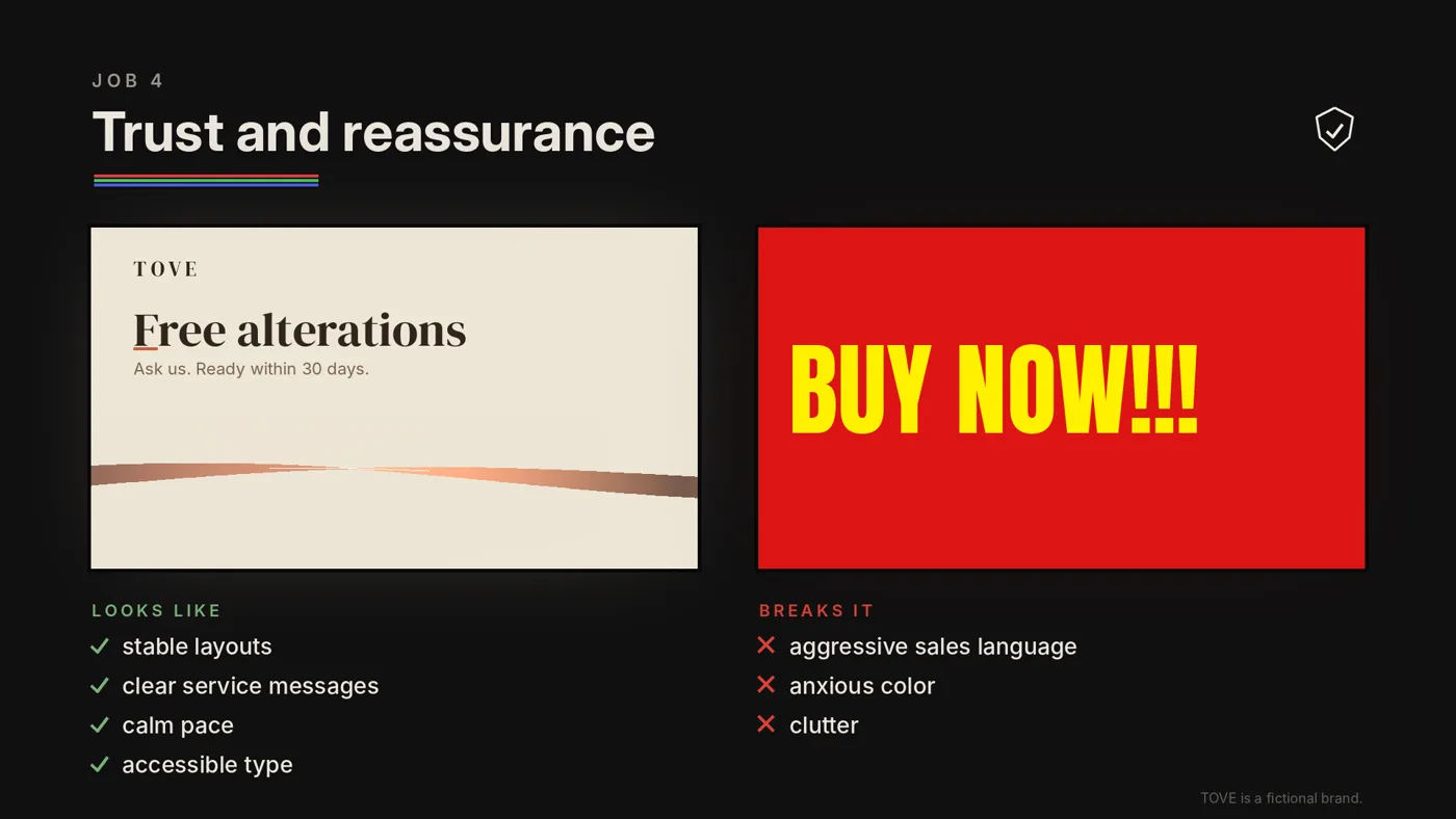
Job 4: Trust and reassurance
Reduce uncertainty, especially where stakes are higher.
This job is underestimated because it doesn't look like "marketing." But in health, finance and premium beauty, a hesitant customer needs reassurance before anything else.
Trust content matters most in:
- pharmacy / health
- finance / telecom
- premium beauty
- any context where people worry about authenticity, service, or privacy
Trust and reassurance answers:
- Is this place credible?
- What services exist?
- What should I do if I need help?
- What's the process?
What it looks like
- stable layouts (not chaotic promos)
- clear service messaging ("Ask us", "Consultation available", "Authenticity guaranteed")
- calm motion pace
- accessibility-minded typography
What breaks it
- aggressive sales language in sensitive contexts
- health claims the product is not allowed to make (they are regulated in the EU, the UK and Turkey)
- clutter
- loud color behavior that feels anxious
Trust content makes the space feel managed.
Job 5: Conversion support
Promote without annoying.
Yes, screens can sell. But if the screen feels like a pop-up ad, the store loses more than it gains.
Conversion support works when it behaves like:
- helpful signage
- a gentle reminder
- a consistent highlight, repeated enough to land over time
Conversion support answers:
- What's the one thing we want people to notice today?
- What's the best offer that won't make the store feel cheap?
- What's the natural add-on here?
What it looks like
- one offer at a time
- one category highlight per zone
- simple value framing ("2nd item -30%", "New in: …")
- rhythm that allows reading while walking
What breaks it
- rotating too many SKUs
- rapid fire promos
- price grids
- constant urgency language
- mismatch with what's physically present nearby
Conversion support is not "maximize messages." It's "make one message land."
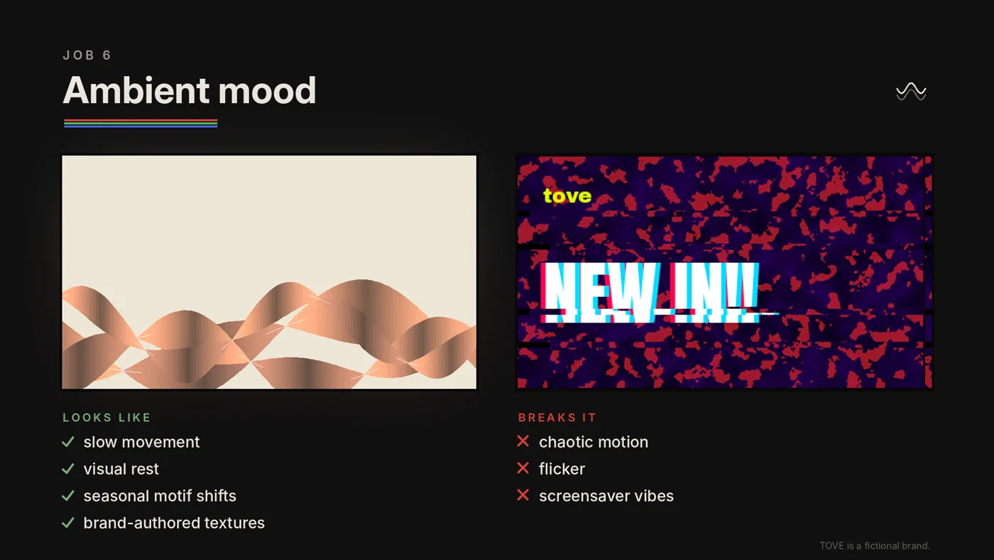
Job 6: Ambient mood
Give the space rhythm without demanding attention.
Some screens should not "push" anything. They should shape atmosphere, like lighting, music, scent and material.
Ambient mood answers:
- What does this space feel like?
- What's the season or time-of-day tone?
- Does this feel premium and calm, or busy and cheap?
What it looks like
- generative patterns
- subtle brand textures
- seasonal motif shifts
- slow movement with visual rest
What breaks it
- chaotic motion
- contrast flicker, and never more than three flashes in any one second (the safety limit for viewers with photosensitive epilepsy)
- too many elements moving at once
- "screensaver" vibes that don't feel brand-authored
Ambient mood is how screens become part of architecture, not just marketing.
The rule that saves your screen program
One screen = one primary job.
You can add a secondary job only if it doesn't sabotage the primary.
When everything is urgent, nothing is legible.
If you do this one thing, job assignment, you'll notice something immediate: internal debates get shorter.
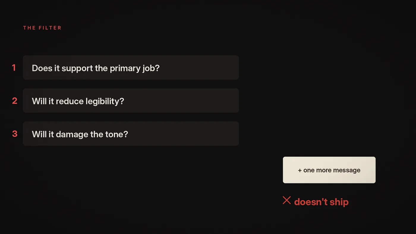
Because suddenly, when someone asks to add more messages, you can ask:
- Does it support the primary job?
- Will it reduce legibility?
- Will it damage the tone? If yes, it doesn't ship.
What screens are not for
Now the uncomfortable part. These are the most common misuses we see. If any of these sound familiar, you're not alone: in our experience, this is where most screen networks end up when nobody designs them as a system.
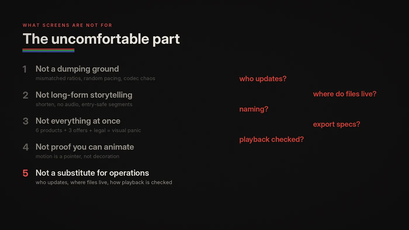
1) Screens are not a dumping ground
A screen program dies the moment it becomes:
"Whatever we have, put it on the screens."
Dumping leads to:
- inconsistent tone
- mismatched ratios
- unreadable typography
- random pacing
- playback failures (codec and bitrate mismatches)
- staff frustration
- customer indifference
2) Screens are not "long-form storytelling"
Brand films are great. But retail is not a cinema.
If you want to use a film, translate it:
- shorten it
- remove dependence on audio
- create entry-safe segments
- design a loop-friendly structure
Retail screens rarely reward plot. They reward clarity.
3) Screens are not for "everything at once"
If your loop tries to show 6 products, announce 3 offers, include legal text, be seasonal, be brand identity and be interactive, you don't get a rich experience. You get visual panic.
4) Screens are not there to prove you can animate
Motion is not decoration. Motion is a pointer. A rhythm. A hierarchy tool.
If motion makes reading harder, it's not design; it's self-sabotage.
5) Screens are not a substitute for operational clarity
If nobody knows who updates content, where files live, how naming and versioning works, what the export specs are, and how playback is verified, then your screen network is not a network. It's a collection of accidents.
A simple way to assign jobs: the 3-line brief
For every screen, write three lines:
- Primary job
- Secondary job
- Do-not-do list
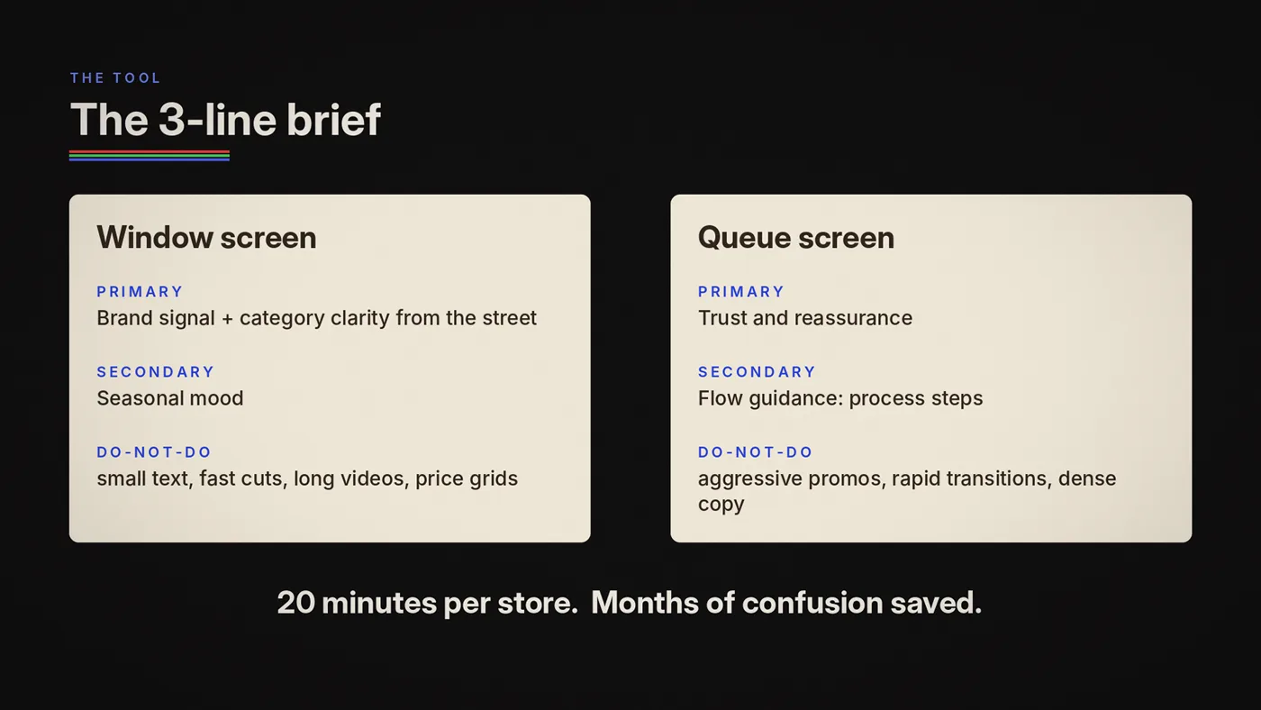
Example: Window screen
- Primary: brand signal + category clarity from the street
- Secondary: seasonal mood
- Do-not-do: small text, fast cuts, long videos, price grids
Example: Queue screen
- Primary: trust and reassurance
- Secondary: flow guidance (process steps)
- Do-not-do: aggressive promos, rapid transitions, dense copy
It is a short exercise, and it settles arguments before they start.
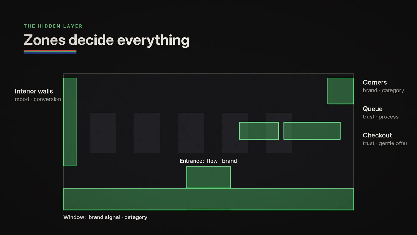
The hidden layer: zones decide everything
Jobs are not abstract. They are tied to physical zones.
- Window: distance + daylight + reflections → brand signal / category clarity
- Entrance: transition + orientation → flow guidance / brand signal
- Interior walls: product competition → ambient mood / conversion support
- Corners: angle + repetition → brand signal / category clarity
- Checkout: stress + privacy → trust / gentle conversion support
- Queue: uncertainty → trust / process clarity
If you ignore zones, you'll end up designing "one content type" and wondering why it fails everywhere.
How to know your screen job is working (fast tests)
You don't need a research agency. You need basic field discipline.
Test A: Walk-by legibility (5 seconds)
Walk past at normal pace. Can you grasp the primary job without stopping? If not: increase hierarchy, reduce text, slow motion, stabilize layout.
Test B: Random entry (1 second)
Look at the screen for one second at a random moment. Does it still make sense? If not: make frames entry-safe, keep the anchor present more often, reduce "transition-only" frames.
Test C: Angle test (especially corners)
View from left/right extremes. Does the message collapse? If yes: move key content inward, increase contrast and weight, treat edges as unsafe.
Test D: Staff fatigue
Ask staff: "After an hour, is this annoying?" Staff are your best repetition sensor. If staff hate it, customers will tune it out too.
A short story about "expensive noise" (and how it flips)
We've watched stores spend serious money on LED screens, then run content that makes the store feel cheaper. In our experience it is common.
The flip happens when the store stops thinking in "videos" and starts thinking in "jobs."
After a job-based reset, the first thing that changes isn't sales. It's atmosphere:
- the store feels more intentional
- the screens feel calmer
- the brand feels coherent
- the staff stops complaining
Then, once the system is stable, measure it, and expect the result to depend on the store. In a 2016 field study, screens lifted sales in large hypermarkets, did little in supermarkets and lowered sales in small convenience stores, and in the large stores the lift faded over five months.
The order matters: coherence first, optimization second.
The deliverable: one-page "6 Screen Jobs" checklist
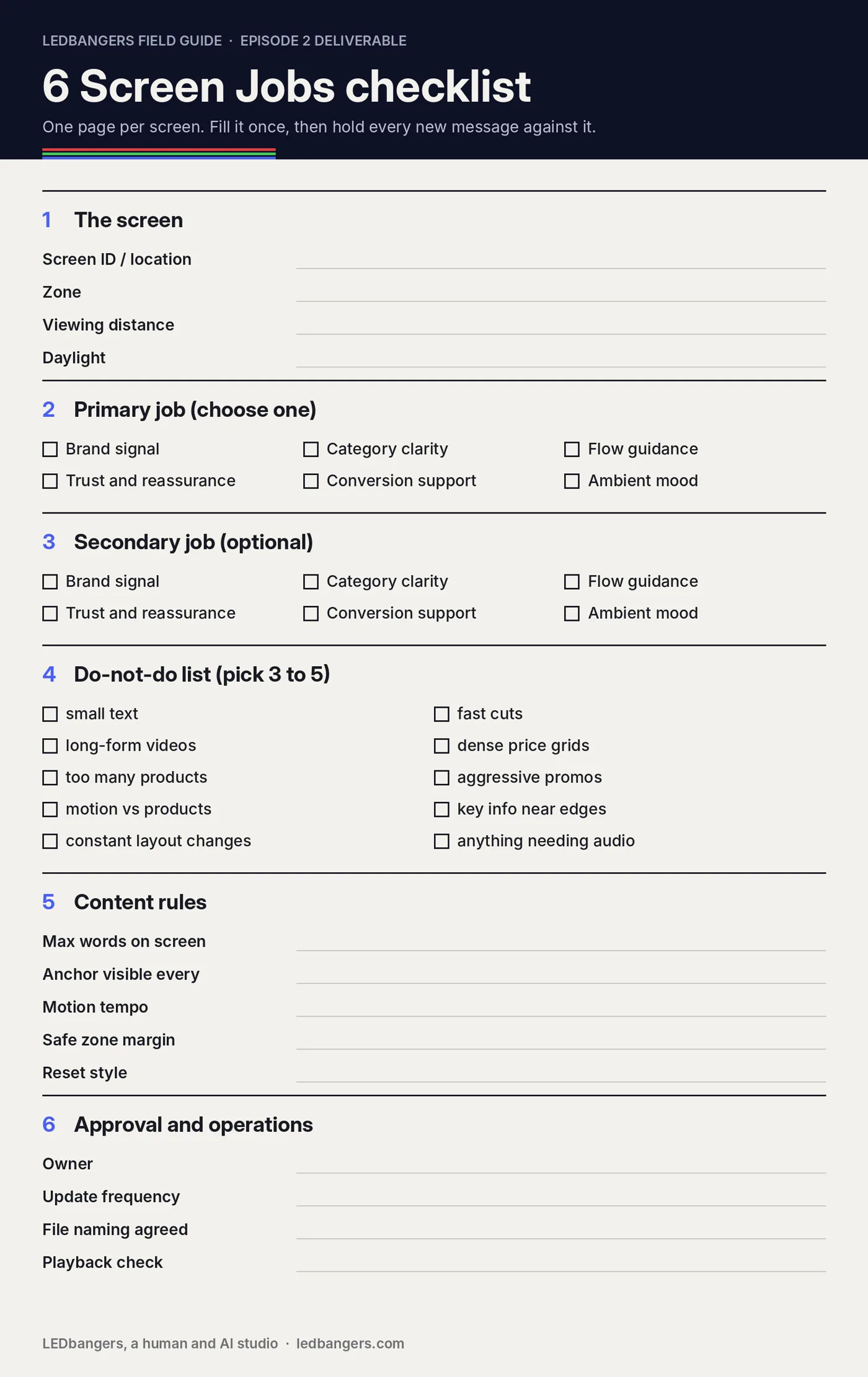
Copy this into a doc and use it in meetings. For each screen, fill in:
Screen ID / location, zone (window, entrance, interior, corner, checkout, queue, other), viewing distance (near, mid, far) and daylight (low, mixed, high glare).
Primary job (choose one) and secondary job (optional): brand signal, category clarity, flow guidance, trust and reassurance, conversion support, ambient mood.
Do-not-do list (pick 3 to 5):
- small text
- fast cuts
- long-form videos
- dense price grids
- too many products per loop
- aggressive promos in sensitive zones
- motion that competes with products
- key info near edges or seams
- constant layout changes
- anything that requires audio
Content rules:
- Max words on screen
- How often the anchor is visible, in seconds
- Motion tempo: calm, standard or energetic
- Safe zone margin: at least 5% from every edge (8 to 10% on LED walls and bands)
- Reset style: fade, dissolve, hard cut or other
Approval and ops:
- Owner
- Update frequency: weekly, biweekly, monthly or seasonal
- File naming convention agreed
- Playback verification method
Cat-to-cat margin note

In-store screens are not there to play media. They're there to do a job inside a space.
In the next episode, we'll zoom into the constraint that makes job-based design real, the 5-second rule: how people read screens while walking, and why most screen content fails before it's even noticed.
Sources: Roggeveen, Nordfalt and Grewal, "Do digital displays enhance sales? Role of retail format and message content", Journal of Retailing 92(1), 2016; W3C, WCAG 2.2, success criterion 2.3.1 Three flashes or below threshold; Ofcom, Guidance note on flashing images and regular patterns in television; EBU R 95, Safe areas for 16:9 television production.