Field Guide EP 11
Aspect ratios in real stores: compose, don't crop
Season 1, Episode 11 of the retail screen field guide. Stores are full of different screen shapes: tall totems, wide walls, long thin bands. A campaign that only exists as one 16:9 file gets cropped, stretched or shrunk to fit them, and the message is what gets lost.
Watch the episodePDF: Ratio Recomposition Standard
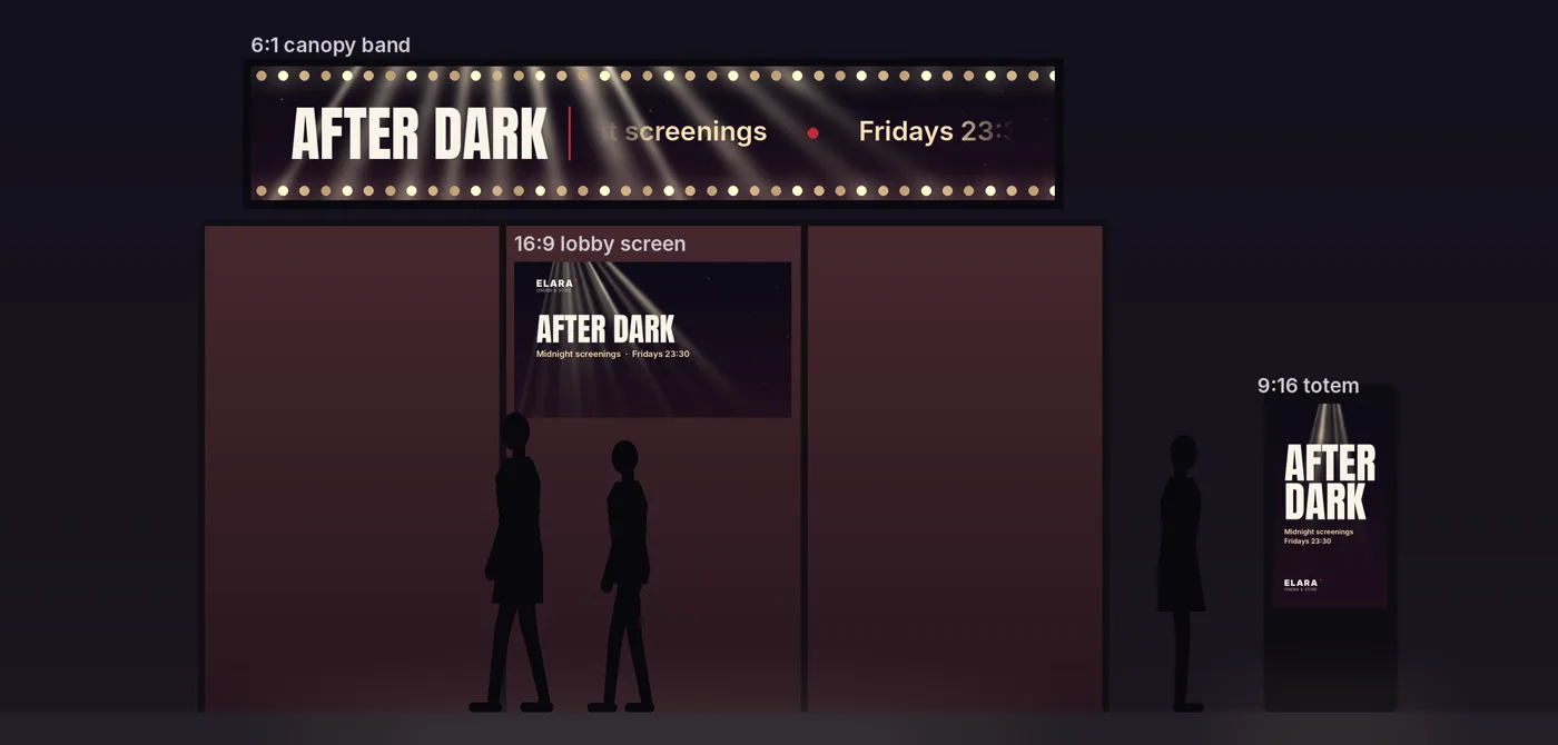
Friday evening at a cinema with a shop in its lobby. Marketing has sent one file for the new late-night season, a good 16:9 loop, and the same file went to every screen. On the totem by the door, the player has cropped it to fit: the word "AFTER" is gone, and so is half of "screenings". On the long band over the entrance, it is letterboxed: a small poster in the middle, black on both sides. On the lobby screen it fits, except for the line along the bottom edge with the date, which the player has quietly cut off.
Nobody made a design mistake. Nobody made a design decision either.
The principle: cropping is not design
On phones, aspect ratios have mostly settled: vertical, square, horizontal, all seen at arm's length. In stores they are built into the architecture. Portrait totems and pillars at the door, landscape screens on walls and over counters, square panels beside doors, long bands on canopies and shelf edges, and odd shapes made from LED modules. Each one is seen from a different distance and angle, often while walking.
A good layout is a hierarchy: what you see first, what you see second, what stays in the background. Change the shape of the frame and that hierarchy has to be rebuilt. A crop does not rebuild it. It only removes things, and it never knows which ones matter.
The four failures we see most often in real stores, and what each one costs, worked out from the ratios:
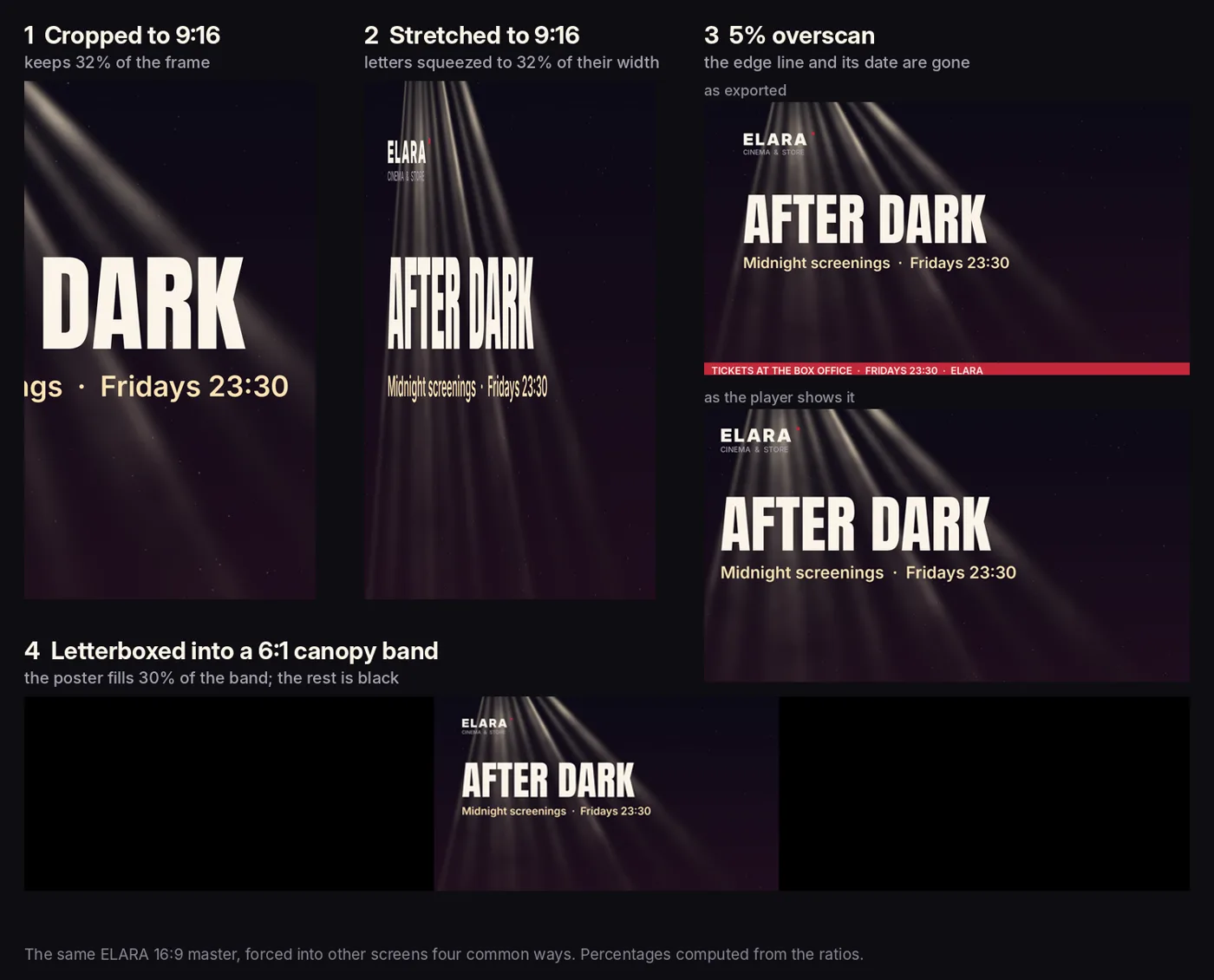
- Cropped to portrait. A 16:9 frame cropped to 9:16 at full height keeps 32 percent of its width. Two thirds of the composition is thrown away, usually including a word.
- Stretched or squashed. The same frame scaled to fill a 9:16 screen squeezes every letter to 32 percent of its width. Logos turn into ovals.
- Edges cut by the player. Some screens and players still overscan: they enlarge the picture and cut off the edges. At 5 percent on each side, a common worst case, 19 percent of the picture disappears, and the line at the very edge goes first.
- Black bars and a tiny poster. A 16:9 poster shown at full height on a 6:1 canopy band fills 30 percent of it. The rest is black, on the most visible screen of the building.
The mechanism: modules, a safe area, a layout per ratio
The fix is to stop making one poster and start making a small set of parts that can be laid out again for each shape. Four parts are enough for almost any campaign:
Anchor. Two or three words that must survive everywhere. "AFTER DARK". If someone sees only this, the screen has still done its job.
Support. One line that adds the detail: "Midnight screenings, Fridays 23:30". It can be switched off when a screen is too small, and the layout still works without it.
Marker. The logo or signature, small and always in a consistent place. It never fights the anchor.
Texture. The moving ground that carries the brand: here, a projector beam drifting through dust. It is made to fill any shape, so it is the one part that is allowed to reach the edges.
Then one rule for the whole network: nothing critical within 5 percent of any edge. That is the graphics-safe margin broadcasters use for 16:9 television, from the European Broadcasting Union's recommendation R 95 (version 1.1, 2017). Treat it as the minimum. On LED walls and long bands, where processors, bezels and cabinet edges can take more, keep critical elements 8 to 10 percent in (Episode 5), and for corner screens add the seam buffer from Episode 7. In a store the margin protects against cropping, bezels, a bent band, a display stand in front, or a seam. The outer edge is texture only.
Then a layout for each family of shapes:
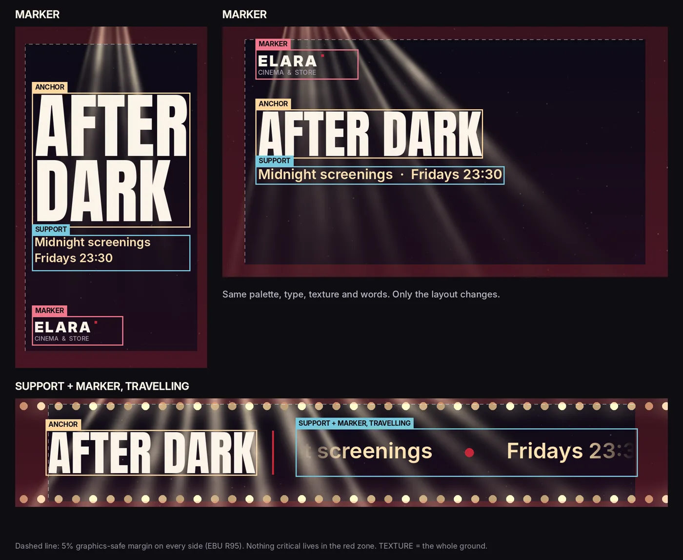
- Portrait (9:16), totems and pillars. Stack the anchor big in the upper third, put the support under it and the marker at the bottom of the safe area. Light that falls from above suits the shape. Avoid long lines and grids.
- Landscape (16:9), walls and lobbies. The anchor on one line, left of centre, the support beneath it and the marker in the top corner. Leave the other side to the texture on purpose. Avoid a tall stack in the middle, which leaves both sides empty.
- Square (1:1), doors and counters. The anchor centred on two lines, the support short.
- Bands (3:1 to 8:1), canopies and shelf edges. A band is not a poster, it is a ribbon. Hold the anchor whole in the left safe core and let the support and the marker travel to the right at a slow, steady speed. Never letterbox.
Seeing it: one definition, every shape
As in every episode: we do not have audience data and we do not fake it. We have production facts from our own work.
Our pharmacy library, the same one from Episodes 6 to 10, is built so that one definition renders every format. In the last batch, the same animation was rendered at 1920 by 1080, 1080 by 1920, 1280 by 720, 1536 by 256, 720 by 1600 and 720 by 720. Everything we render is resolution-independent, so each size is rendered from scratch, never scaled up from another. The rule that made that possible is the one from Episode 8: the mark is held whole, and only the ground, the light and the ornaments move, so nothing important can be pushed off the edge of any shape.
The landscape, portrait and square sizes worked from the same layout. Two did not. On the long window ribbon (1536 by 256, a 6:1 band) and the tall pavement totem (720 by 1600), the same centred mark sat small in a lot of empty panel. We did not ship them. Those two shapes need their own layout, with repeated marks, or the mark with type, not one centred figure. Rendering a design at the right resolution is not the same as composing it for that shape.
ELARA below is built that way. One definition: palette, type, texture recipe and words. Three layouts. The totem stacks, the lobby screen runs one line with space for the light, and the canopy band holds the anchor and lets the rest travel.
The field test
Walk past every screen that runs the campaign, at the distance people really pass it.
- Is the anchor whole and readable on every screen?
- Does any screen show black bars, stretched letters or a cut word?
- Can you see the very edge of the picture? Put a one-pixel frame around a test file: if any side is missing, the player is cropping.
- Does it still feel like one brand on all of them?
Then ask a member of staff to tell you what the campaign says. If the answer depends on which screen they looked at, it is not one campaign yet.
The deliverable: the Ratio Recomposition Standard
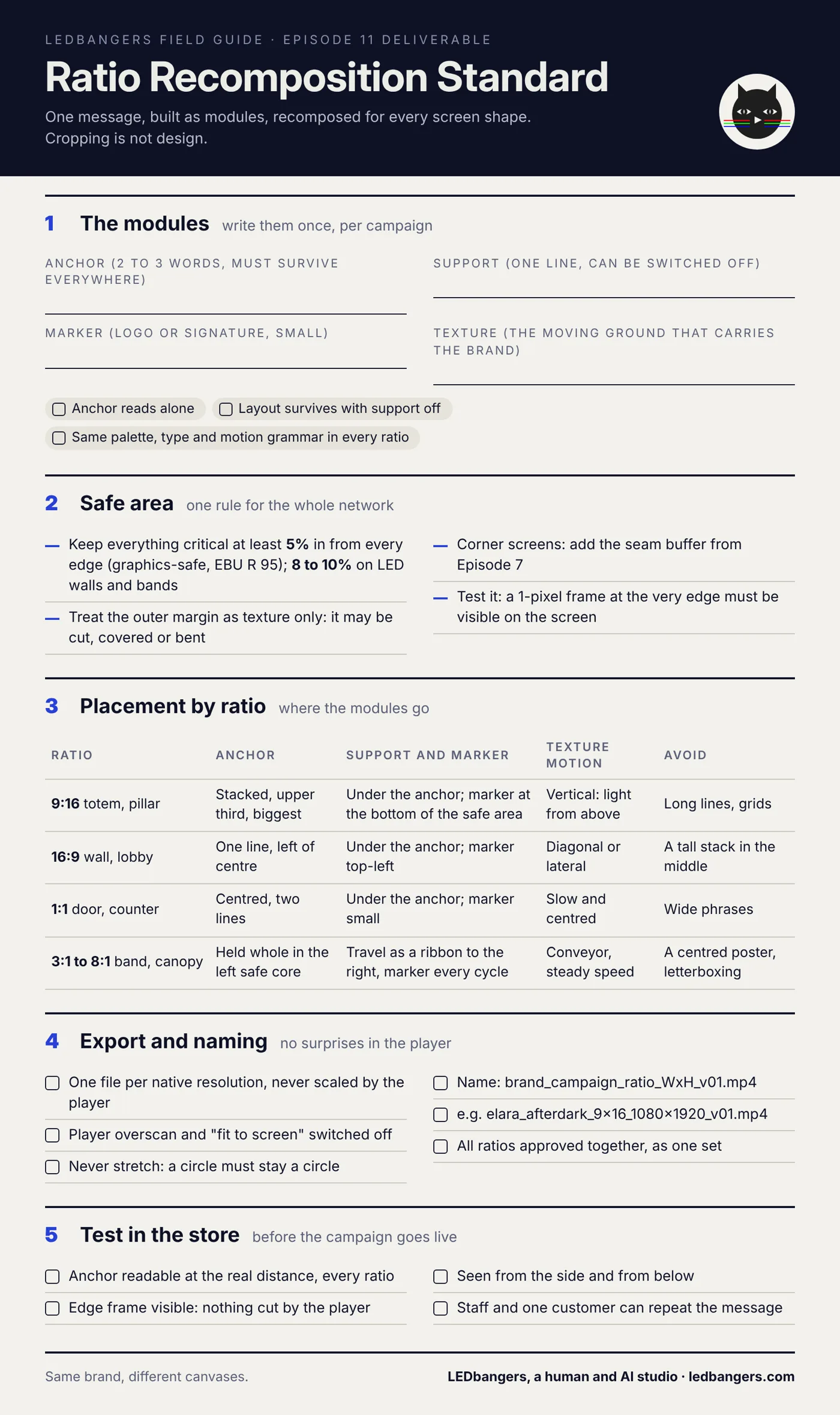
This episode's sheet is the standard in one page: the four modules to write once per campaign, the 5 percent safe area, where the modules go in each ratio family, export and naming rules so every file plays at its native size, and the in-store test.
The blank sheet is below. Hand it to whoever makes the content and whoever runs the screens. If you want one campaign built for every screen you have, start a brief at ledbangers.com.
One thing to keep
Every screen shape is its own canvas. Build the message as parts, keep them at least 5 percent in from every edge, and lay them out again for each shape. Never crop, stretch or letterbox.
Next episode
Episode 12, content scheduling that does not collapse: a simple monthly system of evergreen layers, seasonal skins, campaign slots and local messages, so the screens stay fresh without a scramble every week.
If you want the field guide as it ships, plus the deliverable from every episode, follow LEDbangers. If your campaign lives as one 16:9 file, start a brief at ledbangers.com.
LEDbangers is a human and AI studio making code-first motion for retail LED and OLED screens. This episode was researched and written with AI, built on our own research base and on interviews with Burcin Inan Ozel, who reviewed and edited every line. The figures are made in the studio the same way: one definition rendered to every shape. Poma and Luma are the two cats who argue in the margins: instinct and structure, the two halves of every good screen.
Sources: graphics-safe and action-safe margins for 16:9 production, EBU R 95; overscan and safe areas on flat panels, Wikipedia, Safe area (television)).