Field Guide EP 10
Choosing the right screen: brightness, pixel pitch and distance
Season 1, Episode 10 of the retail screen field guide. A lot of bad screen content is really a bad screen decision, made months before anyone designed a frame. In plain English: how much light, how many pixels, how close, and who runs it.
Watch the episodePDF: Screen Spec Card
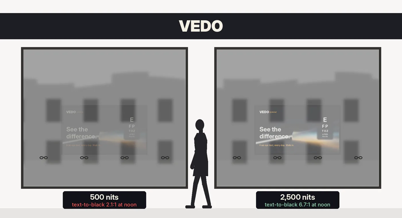
Noon on a sunny high street. An optician has paid for a good window screen and a good loop to run on it: a slow beam of light splitting through a lens, the line "See the difference.", a small eye chart in the corner. From the pavement it is a grey rectangle with the street reflected in it. The design is fine. The screen is a model built for a showroom, and it is losing a fight with the sun.
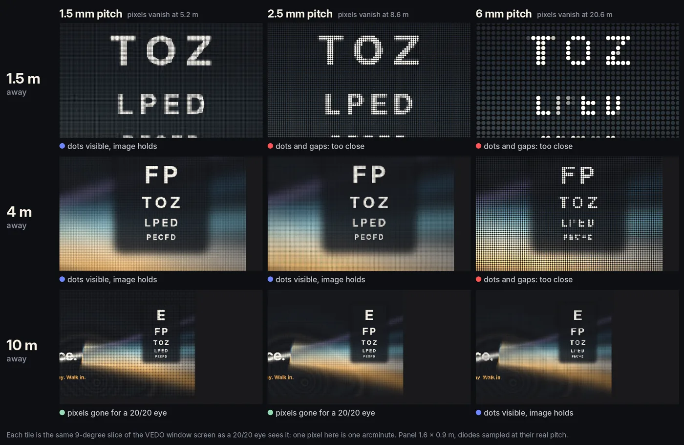
Inside, a second screen was bought by the square metre because the price was right: a 6 mm LED wall mounted beside the frames, where people stand a metre and a half away. Up close, every letter is a pattern of dots with gaps between them. Six months later, a third screen in the back of the shop is black, because nobody owns it.
None of these is a content problem. All three show up as one.
The principle: buy a viewing condition, not a screen
The display industry sells numbers: bigger, brighter, sharper, 4K, HDR. Retail does not need the biggest numbers. It needs the right ones for one spot in one store, and those come from physics and operations, not from the brochure.
The three failures we see most often in real stores:
- Too dim in the window. An indoor screen behind glass, washed out by daylight and reflections.
- The wrong pixel pitch. A coarse LED panel where people stand close: visible dots, mushy text.
- Nobody runs it. No owner, no system, no monitoring. The screen freezes, goes black, or plays one file for a year.
Each one is decided before the first frame is designed.
Brightness: the sun is the competition
Screen brightness is measured in nits, one candela per square metre. The light falling on things is measured in lux. Office lighting is roughly 320 to 500 lux. An overcast day is about 1,000. Full daylight out of direct sun is 10,000 to 25,000, and direct sun 32,000 to 100,000.
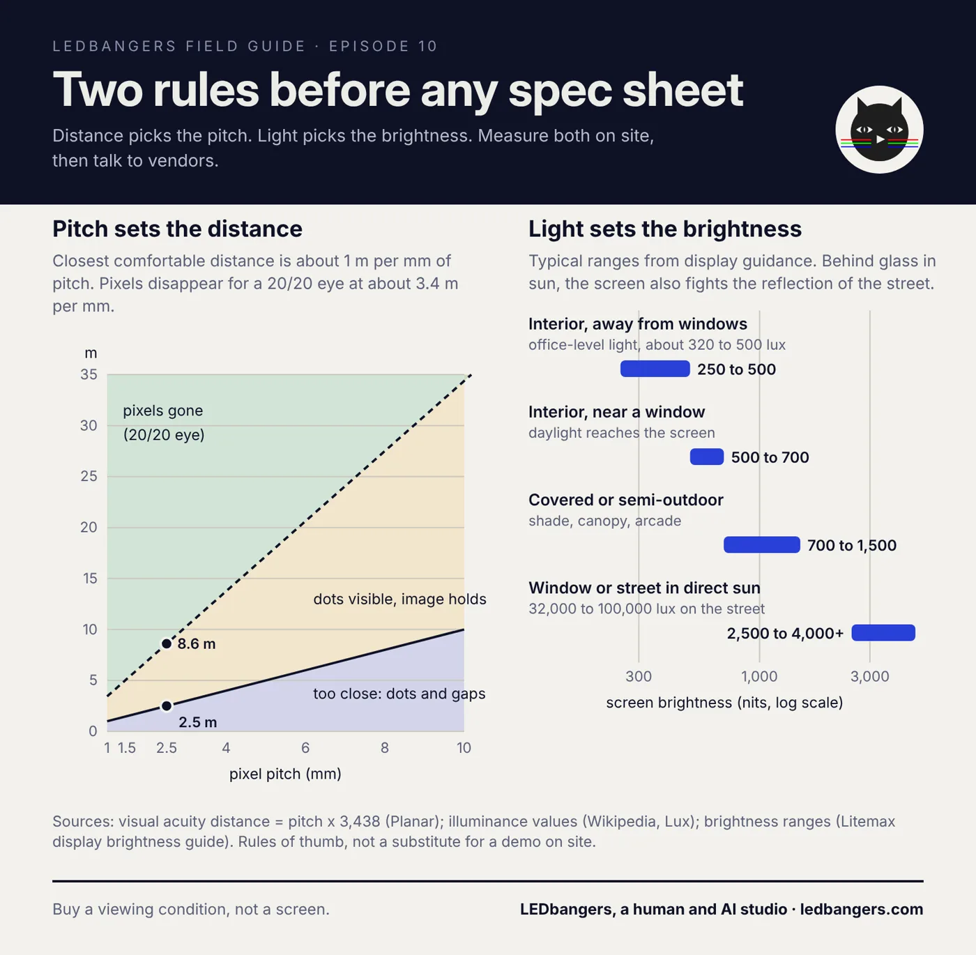
Indoors, a screen is competing with office-level light, and a few hundred nits is enough. One display maker's guidance puts interiors away from windows at about 250 to 500 nits, interiors near a window at 500 to 700, covered or semi-outdoor spots at 700 to 1,500, and direct sun at 2,500 to 4,000 or more.
The window is the hard case, because of the glass. Plain glass reflects about 4 percent of the light at each surface, so a pane sends back roughly 8 percent of whatever is in front of it. A light facade across the street in full sun can easily measure 5,000 nits: 32,000 lux on a surface that reflects half the light gives about 5,000 nits (lux times reflectance, divided by pi). Eight percent of that is about 400 nits of street laid over your screen, before anyone has pressed play.
Do the arithmetic, assuming 92 percent of the screen's light gets through the glass and its black glows at half a nit. A standard 500-nit screen behind that glass gives white text against black a ratio of about 2.1 to 1. A 2,500-nit window model gives about 6.7 to 1. Last episode we used the web's accessibility minimum for text, 4.5 to 1. One screen fails it at noon, the other passes. That is the whole cover image.
Brightness is a zone decision. The window needs power. The interior needs restraint, and a screen that can be dimmed on a schedule, because the same panel that fights the sun at noon is too bright at eight in the evening. Street-facing screens can also face night limits: the UK outdoor industry's roadside code caps large digital screens at 300 to 600 candelas per square metre after dark.
Pixel pitch: distance in disguise
Pixel pitch is the distance between the centres of two neighbouring LEDs, in millimetres. Smaller pitch means more diodes, a smoother image up close, and a higher price. Larger pitch is cheaper and fine from far away.
Two rules of thumb do most of the work:
- Closest comfortable distance: about 1 metre per millimetre of pitch. A 2.5 mm panel works from about 2.5 metres for pictures and video. Closer than that, you see dots and gaps.
- Where the pixels disappear: about 3.4 metres per millimetre. Display maker Planar calls this the visual acuity distance: pitch times 3,438 gives the distance, in millimetres, at which a person with 20/20 vision stops seeing individual pixels. A 2.5 mm panel goes smooth at about 8.6 metres. A 6 mm panel needs more than 20.
Text needs more than pictures. The classic dot-matrix letter is 5 diodes wide and 7 tall, and below that letters stop being letters. So the smallest line of type on a screen should be at least seven diodes tall, which on a 6 mm panel means more than 4 centimetres, at any distance.
And people get closer than the floor plan says. They step in to read, queue under the screen, stand in front of it to pay. Design for the closest distance someone will actually be, not the ideal one.
The mechanism: the Screen Spec Card
Before you talk to a vendor, write four lines for every location. This is the real spec sheet. Everything else follows from it.
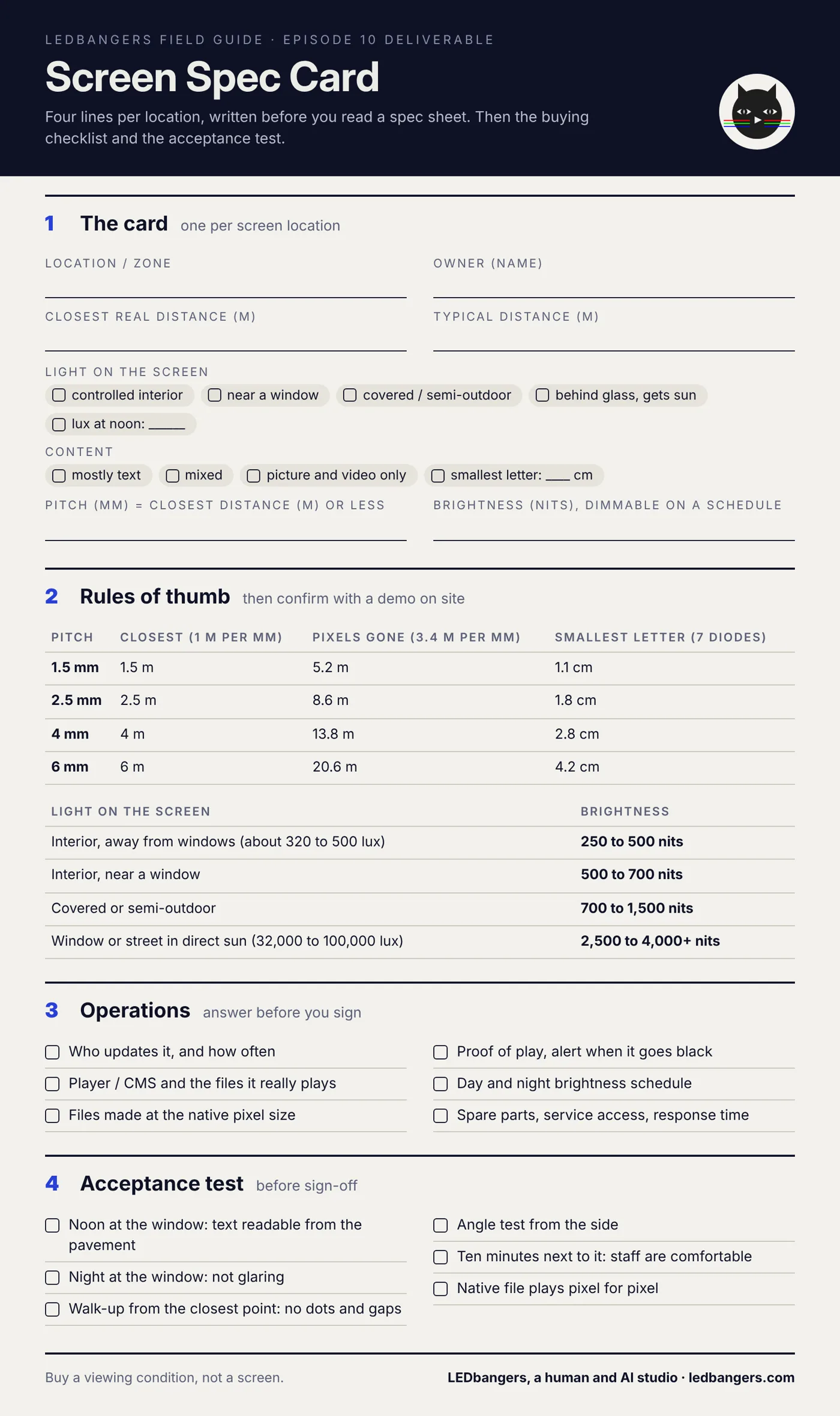
1. Closest real distance, then pitch. Measure where people actually stand. Pitch in millimetres should be no more than that distance in metres. If the screen carries type, go finer, and check that the smallest letter is at least seven diodes tall.
2. Light on the screen, then brightness. Note whether it is a controlled interior, near a window, or behind glass that gets sun. A cheap lux meter or a phone app at noon gives a rough reading, which is more than most projects ever measure. Then pick from the ranges above, and ask for brightness that can be scheduled.
3. Content, then canvas. The native pixel count of the panel is the canvas. Every file should be made at exactly that size, not scaled by the player.
4. Owner, then operations. Name the person who updates it, the system that gets files onto it, and the way you will know it is still playing.
Seeing it: a cross sign and a counter screen
As in every episode: we do not have audience data and we do not fake it. We have production facts from our own work.
Our pharmacy library, the same one from Episodes 6 to 9, runs on two very different kinds of hardware, and the spec decides the design more than any style does. We write every screen format down in diodes, not pixels, because the diode count is the real resolution. The library carries ten formats across two classes.
The first class is the projecting cross sign over the street: on the coarse units, about 40 by 40 diodes, a single colour of green, effectively on or off, read from 10 to 40 metres in hard daylight. At that pitch, the gradients and atmospheres that look rich on a counter screen collapse into noise, or into nothing. The cross wants one bold silhouette, closed shapes and thick strokes. The second class is the rectangle: window, totem and counter screens with fine pitch, full colour and a viewer standing close. Those take the field work and the type.
So every piece ships twice: a native file at the panel's true diode count for the sign controller (the 40 by 40 version is 11 kilobytes), and a full-size simulation for the shop page. We add a GIF, because in our experience sign controllers accept GIF more reliably than H.264 video. And we do not publish a supported-format list until it has been tested on real hardware. Getting that wrong means refunds, not complaints.
Operations: the part that fails after install
A screen can have the right brightness and the right pitch and still fail, because nobody runs it. Before buying, get answers to these:
- Who updates the content, and how often?
- What player or content system runs it, and which files does it actually play: codec, frame rate, exact pixel size?
- How do you know it is playing? Proof of play, and an alert when it goes black.
- Does brightness follow a day and night schedule?
- Who replaces a failed module or panel, and how fast can they get parts?
The deliverable: the Screen Spec Card and buying checklist
This episode's sheet is the four-line card for each location, the rules of thumb with the numbers, the operations questions, and an acceptance test to run before you sign off: noon at the window, night at the window, the walk-up from the closest point, the angle from the side, and ten minutes standing next to it.
The blank sheet is below. Save it and take it to the vendor meeting. If you want a second pair of eyes on a spec before you buy, start a brief at ledbangers.com.
One thing to keep
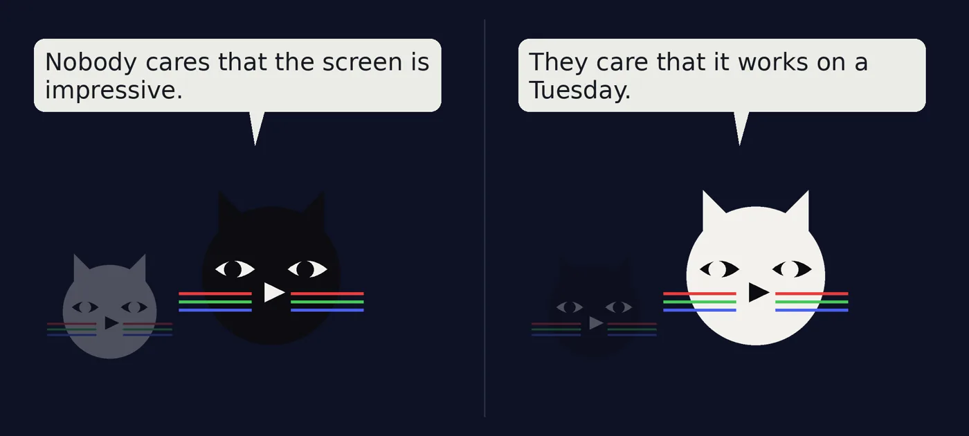
Measure how close people get and how much light hits the glass before you look at a single spec. Then make sure someone owns the screen after the installer leaves.
Next episode
Episode 11, aspect ratios in real stores: 9:16, 16:9 and ultrawide, why cropping is not design, and how to build compositions that survive every shape.
If you want the field guide as it ships, plus the deliverable from every episode, follow LEDbangers. If you are about to buy screens, start a brief at ledbangers.com and send us the four lines first.
LEDbangers is a human and AI studio making code-first motion for retail LED and OLED screens. This episode was researched and written with AI, built on our own research base and on interviews with Burcin Inan Ozel, who reviewed and edited every line. The figures are made in the studio the same way, and the pitch and brightness simulations are computed, not drawn. Poma and Luma are the two cats who argue in the margins: instinct and structure, the two halves of every good screen.
Sources: visual acuity distance, Planar; about one metre of viewing distance per millimetre of pitch, Christie; typical illuminance values, Wikipedia, Lux; brightness ranges by environment, Litemax; reflection at a glass surface, Wikipedia, Fresnel equations; night brightness limits, Outsmart roadside code%20EDIT.pdf); the 4.5 to 1 text contrast minimum, W3C WCAG 2.2, 1.4.3.