Field Guide EP 08
Checkout screens: help at the till, not pressure
Season 1, Episode 8 of the retail screen field guide. Checkout is the most stressed metre of the store. A screen there should feel like good service: reassure first, explain the process second, and sell one thing, gently, last.
Watch the episodePDF: Checkout Content Ladder
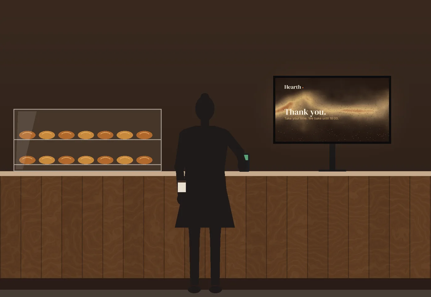
Saturday, 11:40, a busy bakery. There are six people in the queue. The woman at the front is holding a coffee, a bag of rolls and her phone, trying to remember whether this place takes contactless. The screen above the counter is a metre from her face, at full brightness, and it is running the window loop: a red background, "TRY OUR NEW SMOOTHIE BOWL!", a grid of six prices that reshuffles every second and a half, a countdown that blinks "ENDS IN 00:14:52". There is no smoothie bowl anywhere on the counter. She looks away from the screen to find the card terminal. So does the person behind her.
The screen did its best to sell. It made paying harder.
The principle: checkout is about finishing
Every other zone in this series has been about getting attention: the window from the street (Episode 6), the corner from two paths (Episode 7). Checkout is different. The customer is already in, has already chosen, and is now doing several things at once: holding the products, finding a card, adding up, watching the queue, talking to staff, sometimes answering a question they would rather not answer in public.
So the job changes. A checkout screen has three outcomes and only three:
- Less friction. People finish paying faster and with fewer questions.
- More trust. The space feels managed and calm, and nobody feels watched.
- One gentle add-on. One relevant extra, offered once, that the customer can actually see and reach.
Anything more is noise at the exact moment people need quiet.
The four checkout failures we see most often in real stores are all versions of the opening scene:
- The promo wall. Prices, offers and product grids rotating fast while people pay.
- Window content, reused. The loop built to stop people on the street, now at arm's length.
- Too bright, too flickery. A screen set up for distance, glaring at close range, until the staff turn it off.
- An add-on that is not on the shelf. The screen offers something nobody can see or reach at the till, so the offer reads as fake.
Annoyance at the till rarely shows up as a number. It shows up as a longer-feeling queue, staff who get blamed for the screen, and a brand that feels cheaper than its products.
The mechanism: the Checkout Content Ladder
The method is a ladder of three steps, in order. Each step only works if the one below it is solid.
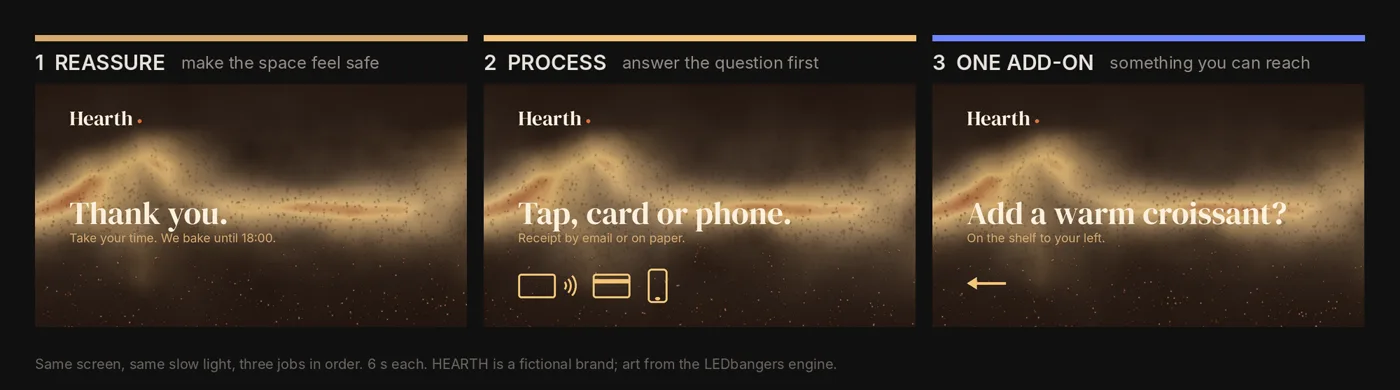
Step 1: Reassure. Before the screen sells anything, it makes the space feel safe and managed. "Thank you." "Take your time." "Easy returns." "Ask us anything." It sounds soft. It is the step that buys the right to the other two. Design: almost no motion, a stable composition, large calm type, warm language.
Step 2: Explain the process. Answer the question people are about to ask before they ask it. How to pay: tap, card or phone. Where the receipt goes. Loyalty, if you have it. Returns in one line. Design: short phrases, icons where they help, long holds, because people are reading this while doing something else.
Step 3: One gentle add-on. Only now does the screen sell, and only one thing. It has to be relevant, physically present near the till, and offered as help rather than urgency: "Add a warm croissant?" pointing at the shelf where the croissants are. Design: one idea, one message, repeated calmly for weeks rather than rotated daily.
The ladder comes with its own design rules, because checkout is a close-view zone:
- Calmest tempo in the store. Fewer transitions than any other zone, holds of six seconds or more, nothing that moves behind the words.
- Brightness for arm's length. A screen a metre from someone's face needs a fraction of the brightness a window needs (Episode 6). Turn it down until the staff stop noticing it.
- No flicker, no flashing. Beyond annoyance, rapid flashing is an accessibility issue: the web's accessibility guidelines treat more than three flashes in any one second as a risk for people with photosensitive conditions, unless the flashes stay below set brightness thresholds. Broadcast and out-of-home guidance sets those limits in absolute luminance, which a bright LED crosses more easily than a web page. A checkout loop should never come close.
- Large, heavy, short type. People are distracted, not far away. Size for distraction.
- Nothing at the edges. Staff stand in front of the screen, terminals and bags cover the corners, players crop. Keep the message in the middle.
On choice: a famous study by Sheena Iyengar and Mark Lepper set out a tasting display in a grocery store over two Saturdays, swapping between 24 jams and 6 jams every hour. The big display stopped more people, 60 percent against 40, but only 3 percent of those who stopped at it bought a jar, against almost 30 percent at the small one. It is often quoted as proof that more choice always sells less. It is not. A 2010 meta-analysis of 63 conditions found the average effect of more choice to be close to zero. A 2015 meta-analysis found when it does appear: when the options are hard to compare, the decision is difficult, people are unsure what they want, and they want to decide with little effort. That describes the till. One add-on is a design decision for that moment, not a law of nature.
Regulators already treat the checkout as a special zone. In England, since 1 October 2022, businesses with 50 or more staff may not place foods high in fat, sugar or salt within two metres of a checkout or a designated queuing area in stores over 185.8 square metres. Wales followed in March 2026 and Scotland in October 2026. The government's stated reason is that these foods are associated with a greater propensity to create impulse purchases. One caution for grocers: in a store the rules cover, a croissant counts as a less healthy morning good, so it cannot be the till add-on. A bakery-cafe like HEARTH, selling food to eat now, generally falls outside the placement rules. The screen is part of the same metre of floor.
Seeing it: a pharmacy counter, and one bakery till
As in every episode: we do not have audience data and we do not fake it. We have production facts from our own work and illustrations you can judge for yourself.
The checkout case we know best is the pharmacy counter. One of the products we build is a library of animations for pharmacies, and alongside the street signs it includes loops for the rectangular screens inside, near the counter. A pharmacy counter is the strongest version of the privacy problem: people discuss prescriptions and symptoms there, sometimes with a queue behind them. So the counter loops follow one rule we wrote into the code: the mark is held whole and still, and only the ground, the light and a little ornament move. Nothing flashes, nothing cuts, nothing asks to be watched. The screen tells you where you are and then gets out of the way of the conversation.
Now the bakery. HEARTH is a fictional bakery-cafe. Its screen art is made in our studio: a slow, warm glow like an oven door, a little drifting steam, crumbs of light rising through it. On the left, the promo wall from the opening scene. On the right, the ladder: three messages, six seconds each, the light moving slowly underneath, and an add-on arrow pointing at the pastry case that is actually on the counter.
Running it for a month
A checkout screen does not need a content calendar. It needs two layers:
- Always on, every day: the reassurance and process steps. Write them once; change them only when the payment options or opening hours change.
- One add-on per month: pick one category that is physically at the till, write one line for it, and leave it for four weeks. Repetition is how a calm message lands. Rotating weekly mostly teaches people to ignore the screen.
How to tell whether it works, without inventing data: fewer repeated questions at the till ("Do you take contactless?"), a change in how often the add-on is picked up compared with last month, and the staff. If the people who stand next to the screen all day want it switched off, it is failing.
The deliverable: your Checkout Content Ladder
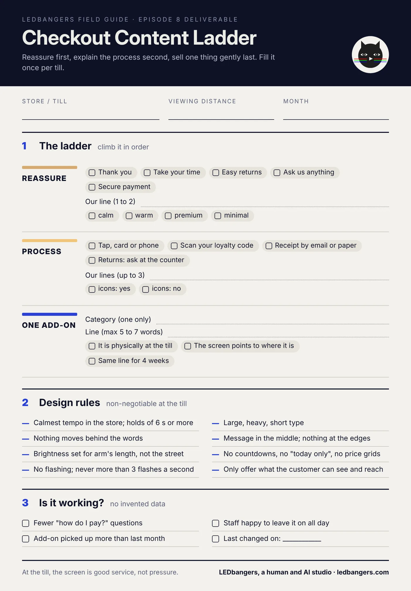
This episode's sheet is the ladder as a worksheet: one or two reassurance lines, up to three process lines, one add-on (with a box to confirm it is actually on the shelf), and the design rules that keep the screen calm. Fill it once per till.
The blank sheet is below. Save it and fill it in. If you want it filled for your counter, start a brief at ledbangers.com and we will write the ladder with you.
One thing to keep
At checkout, reduce stress first, explain the process second, and sell one thing, gently, last.
Next episode
Episode 9, queue screens: how calm, trust and clear information make a wait feel shorter, and why a queue screen is the one place where telling people what happens next is the whole job.
If you want the field guide as it ships, plus the deliverable from every episode, follow LEDbangers. If your till screen is still running the window loop, start a brief at ledbangers.com.
LEDbangers is a human and AI studio making code-first motion for retail LED and OLED screens. This episode was researched and written with AI, built on our own research base and on interviews with Burcin Inan Ozel, who reviewed and edited every line. The figures are made in the studio the same way. Poma and Luma are the two cats who argue in the margins: instinct and structure, the two halves of every good screen.
Sources: the jam study, Iyengar and Lepper (2000).pdf), and its replications, summarised by Jason Collins; meta-analyses, Scheibehenne, Greifeneder and Todd (2010) and Chernev, Böckenholt and Goodman (2015); checkout placement rules, gov.uk guidance, the explanatory memorandum, Wales and Scotland; flashing thresholds, W3C WCAG 2.2, 2.3.1 and Ofcom.