Field Guide EP 07
Corner screens: one screen, two paths, seen twice
Season 1, Episode 7 of the retail screen field guide. A corner screen is not one billboard. It has two faces, a seam, and people who reach it from two directions. Here is how to design for all of that, and when to use the corner's one real trick.
Watch the episodePDF: Corner Safe-Zone Sheet
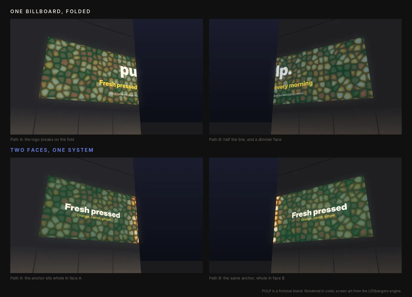
A juice bar takes the corner unit of a shopping mall. Two shopfronts, one on each corridor, and above them a screen that wraps the corner: one face down each corridor, a fold in the middle. The launch film is the same one they post online. The logo sits dead centre.
Dead centre is the fold. From the left corridor the logo reads "pu". From the right it reads "lp.". The headline runs across both faces, so each corridor gets half a sentence. The right face was installed a week later from a different batch, and it is a shade cooler and dimmer than the left. Every person who walks past sees a broken screen, and most of them pass it twice.
The principle: a corner is seen twice
Episode 6 split the store into zones. A corner is a zone with an extra property: it sits where people change direction. That gives it two approach paths, and from most of the street or corridor you can only see one face at a time. The person coming down corridor A sees face A. The person coming down corridor B sees face B. A lot of people see both, one after the other, within a few seconds as they turn.
That is the corner's advantage. Most screens get one glance; a corner gets two from the same person. Used well, two glances build recognition faster than any flat screen of the same size. Used badly, they show the same person the same mistake twice.
The failures we see most often in real installs all come from treating the corner as one flat billboard that happens to be folded:
- Text across the seam. A headline or a price split by the fold, unreadable from either side.
- Divided logos. The mark sits on the fold and each path gets half of it.
- One-direction content. A layout that only makes sense if you stand in front of it, which nobody does.
- Faces that do not match. Panels from different batches or with different calibration, so the seam looks like a crack. LED modules vary from one production batch to the next, which is why integrators order both faces, and the spares, from a single batch.
- Thin and small type. Corners are almost always seen at an angle, and fine strokes are the first thing an angle takes away.
The mechanism: two faces, one system
The method is to stop designing one composition and start designing two that belong together.
Map the paths first. Before any design, mark path A and path B on a plan of the space. For each path, answer one question: what should someone understand in one or two seconds from this direction? That is the anchor for that face.
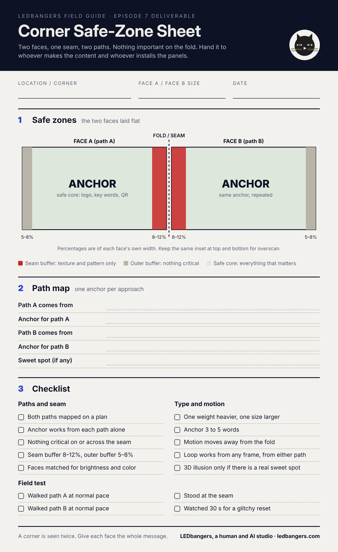
Treat the seam as a fault line. Panels never align perfectly, brightness differs slightly from module to module, and the fold eats detail. Nothing critical goes on or across it: no logo, no key word, no price, no QR code, no face, no product hero, no thin line. The seam is for texture, pattern and low-stakes motion that can afford to break.
Give each face its own safe core. Each face gets a buffer next to the seam, about 8 to 12 percent of that face's width, and a buffer at its outer edge, about 5 to 8 percent. Everything that matters lives in the space between. If a design breaks this rule, it breaks in the store.
Repeat the anchor. The simplest corner system puts the same anchor in the safe core of both faces. Each path gets the whole message, and the person who passes both gets it twice. Repetition is the corner's whole advantage; use it on purpose.
Set heavier, larger type. A typeface that looks right head-on looks thinner from 30 to 60 degrees off-axis. Go up a weight, go up a size, avoid hairline and condensed styles unless you have tested them on the actual corner. Keep the anchor to three to five words.
Move away from the fold. Motion that runs into the seam looks like it is breaking. Motion that drifts vertically, moves away from the fold, or treats the seam as a boundary looks deliberate. Conveyor loops, pulses and slow ambient fields from Episode 4 all survive corners; loops that need a beginning do not, because people arrive mid-loop from two directions.
Mirror textures, not text. Mirroring both faces can look elegant for abstract motifs. It never works for words, which read backwards from one path.
Seeing it: a street sign, and a corner in motion
The usual note on proof: we do not have audience data and we do not fake it. We have production facts from our own work, and illustrations rendered in code that you can judge for yourself.
The cleanest two-path object we build for is a street sign. One of our products is a library of animations for pharmacy cross signs, the kind that hang over the pavement. They are double-sided: one face for each direction of the street, so each face is only ever seen by the people walking towards it. Nobody reads both faces at once, so each face has to carry the complete message on its own: the emblem, held whole and legible, then a swap, then the next. That is the corner rule in its smallest form. Two paths, two faces, the same anchor on each, nothing important left to the edge.
Below, the same rule on a full corner. PULP is a fictional juice bar. Its screen art is made in our studio: a field of citrus-like cells that runs straight across the fold, because texture is allowed there. The anchor sits whole inside each face's safe core and changes every four seconds, the same on both faces, so whichever corridor you come from, and whenever you arrive in the loop, you get the full message.
The corner's one trick, and its catch
Corners are where "naked-eye 3D" lives. Because the screen folds, an image drawn for one exact viewpoint can make the fold disappear and objects seem to come out of the building. Two public examples made the technique famous: the giant cat on Cross Shinjuku Vision, a curved 154.7 square metre screen on the Cross Shinjuku building, facing the station's east exit, that launched in July 2021, and d'strict's Wave in Seoul in 2020, a giant wave that seems to break inside a screen about 80 metres wide and 20 metres high at COEX.
The catch is in the definition. Forced perspective is drawn for one viewpoint. From the sweet spot the illusion is perfect. From anywhere else the same pixels are stretched, sheared shapes, and on a retail corner most people are not at the sweet spot: they are walking along path A or path B.
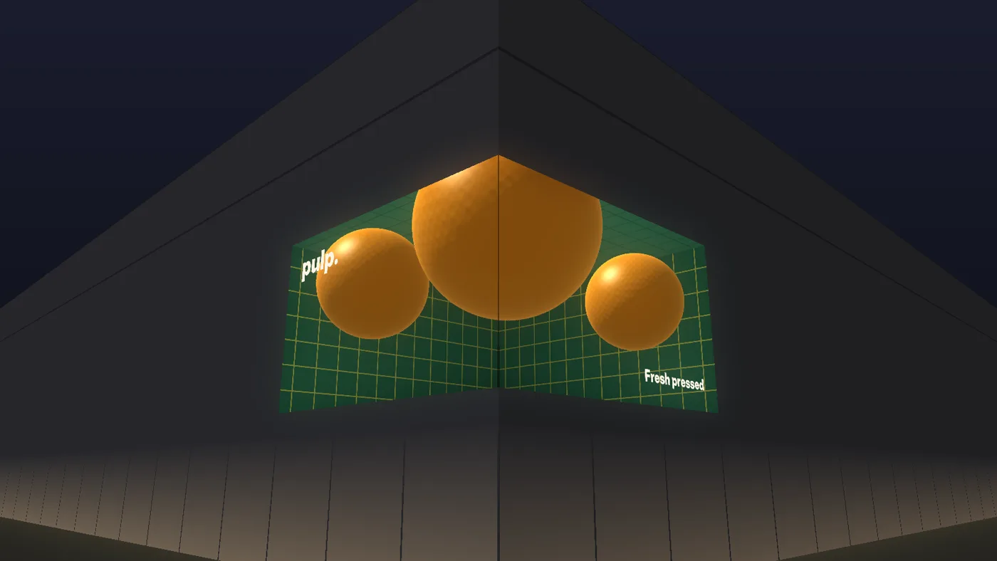
We rendered it for PULP to show both sides. From the diagonal, three oranges roll out of a tiled box carved into the corner and the fold vanishes. Ten metres along the street, the same frame is a pair of orange smears on a slanted grid.
Use it when the space gives you a real sweet spot: a plaza, an escalator landing, the end of a long corridor where most people stop or face the corner straight on. Keep a two-face system for the rest of the day, and never put the brand's only message inside an illusion that most passers-by see broken.
The field test
Three minutes, before you sign off a corner.
- Walk path A at normal speed. Can you read the anchor before you reach the corner?
- Walk path B. Does it still work, with nothing cut off?
- Stand at the seam. Does anything important break, and do the two faces match in brightness and color?
- Watch 30 seconds of the loop. Does the reset look like a glitch at the most visible point?
If anything breaks, it is the safe zones or the loop, not the screen.
The deliverable: your Corner Safe-Zone Sheet
This episode's sheet is the safe-zone standard for any corner: the two faces laid flat with the seam buffer, the outer-edge buffer and the safe core marked, the path map, and the checklist above. Hand it to whoever makes the content and whoever installs the panels.
The blank sheet is below. Save it and fill it in. If you want it filled for your corner, start a brief at ledbangers.com and we will map the paths with you.
One thing to keep
A corner is seen twice: design two faces that each carry the whole message, keep the seam for texture, and save the 3D trick for corners that have a real sweet spot.
Next episode
Episode 8, checkout screens: how to support the sale without becoming the annoying part of paying, and why the best checkout content feels like help.
If you want the field guide as it ships, plus the deliverable from every episode, follow LEDbangers. If your corner screen is showing half a logo to each corridor, start a brief at ledbangers.com.
LEDbangers is a human and AI studio making code-first motion for retail LED and OLED screens. This episode was researched and written with AI, built on our own research base and on interviews with Burcin Inan Ozel, who reviewed and edited every line. The figures are made in the studio the same way. Poma and Luma are the two cats who argue in the margins: instinct and structure, the two halves of every good screen.
Sources: Cross Shinjuku Vision facts from SoraNews24; d'strict's Wave from CNN and Arch2O; the 3D viewing zone, Planar; LED batch variation, Almo Pro AV.