Field Guide EP 09
Queue screens: calm, trust and the next step
Season 1, Episode 9 of the retail screen field guide. People forgive time. They do not forgive not knowing. A queue screen is a service screen, and its whole job is to take the guessing out of the wait.
Watch the episodePDF: Top 10 Queue Messages
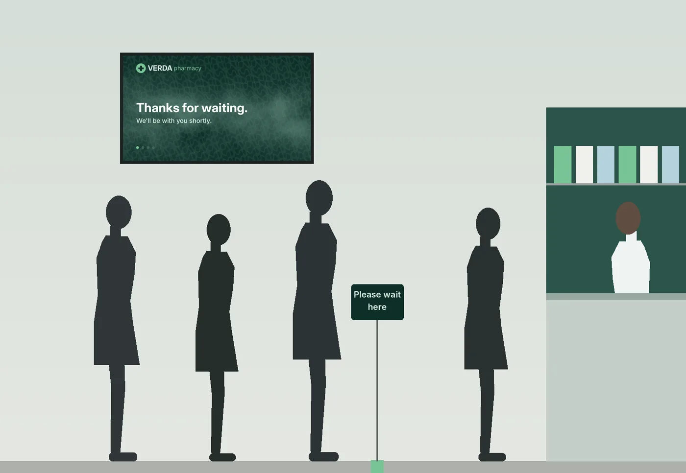
Late afternoon in a pharmacy. Four people are waiting. The man at the back does not know whether he should be in this line or the other one, whether he needs his ID, or how close he is allowed to stand to the person at the counter, who is describing a rash. Above his head, a bright pink screen is advertising a sale on vitamin gummies. Somewhere along its bottom edge, in thin pink type on a pink background, is a line that answers two of his three questions. He cannot read it from where he stands. Nobody can.
He has been waiting four minutes. It feels like ten.
The principle: the problem is uncertainty, not time
In 1985 David Maister, then at Harvard Business School, wrote a short essay called "The Psychology of Waiting Lines". It is still the clearest thing written on queues. Several of his propositions are written for screens:
- Occupied time feels shorter than unoccupied time.
- Anxiety makes waits seem longer.
- Uncertain waits are longer than known, finite waits.
- Unexplained waits are longer than explained waits.
- Unfair waits are longer than equitable waits.
The best-known demonstration is an airport, not a shop. In 2012 the New York Times told the story of an airport in Houston, where passengers complained about the wait at baggage claim. The airport hired more baggage handlers and cut the average wait to about eight minutes, within industry benchmarks, and the complaints kept coming. Then someone noticed that people walked for one minute and stood for seven. The airport moved the arrivals further away, so passengers walked six times longer and stood far less. Complaints dropped to near zero. Nobody's journey got shorter. Only the empty, unexplained part did. It is an anecdote, not a study, but it shows the principle cleanly.
A queue screen cannot make the pharmacist faster. It can do what the airport did: fill the wait with something useful, explain what happens next, and make the line feel fair and managed. So this episode's rule is short.
Reduce uncertainty and you reduce the wait people feel.
The three queue failures we see most often in real stores all leave the uncertainty in place:
- No information. Nothing says how the queue works, what to prepare, where to stand or who to ask.
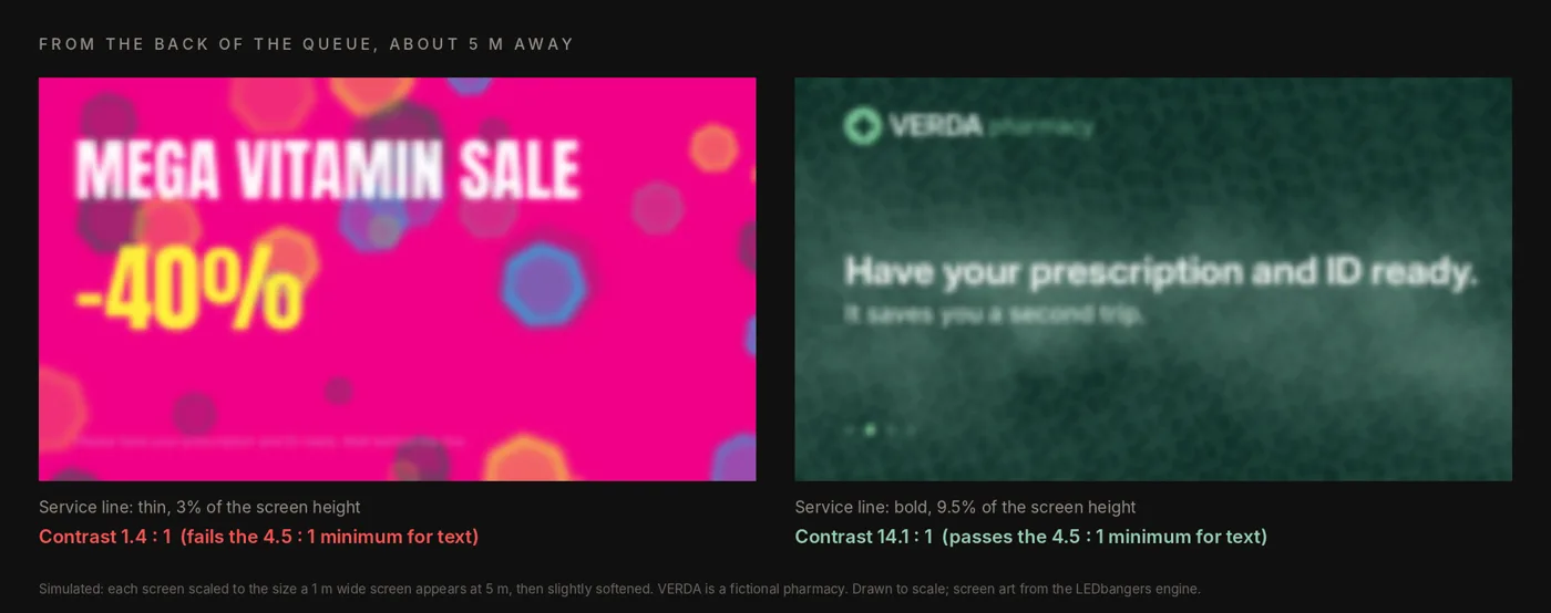
- Unreadable type. Thin weights, low contrast and busy backgrounds, read from the back of the line.
- Promotions in the line. Offers and product grids aimed at people who are not browsing; they are waiting, often worried, sometimes unwell.
The mechanism: the Queue Content Stack
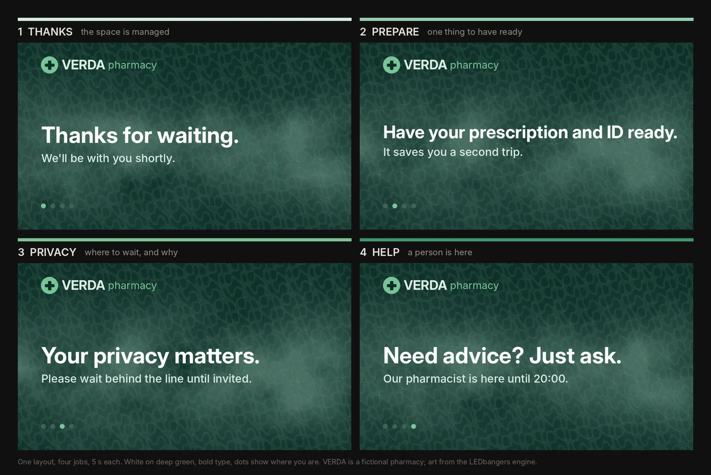
A queue screen has four jobs, in this order, and nothing else is allowed to crowd them out.
1. Thanks. "Thanks for waiting." It costs nothing and it tells people the space is managed and someone has noticed them. It is the queue version of the reassurance step from Episode 8.
2. Prepare. One thing to have ready, in one sentence: "Have your prescription and ID ready." People who are holding the right thing at the counter are faster, and the wait has a task in it, which is Maister's first proposition at work.
3. Privacy. Where to wait and why: "Your privacy matters. Please wait behind the line until invited." In a pharmacy, a clinic, a bank or a phone shop, this line protects the person at the counter and tells the person at the back that the distance is deliberate, not rude. It makes the wait fairer.
4. Help. A person is here: "Need advice? Just ask. Our pharmacist is here until 20:00." It turns the screen from an announcement into an invitation.
Four messages, a few seconds each, the same layout every time. A promotion can earn a place only after these four are working, and in health, finance and other sensitive categories it usually should not get one.
Accessibility is the design
Queue screens are read by tired people, worried people, people with poor eyesight, people reading in a second language, people standing at the back and to one side. For this zone, accessibility is the whole design brief, and most of it can be checked with numbers.
- Contrast. The web's accessibility guidelines ask for a contrast ratio of at least 4.5 to 1 for normal text and 3 to 1 for large text. Measure it. A screen is not a web page, but the arithmetic of light against dark is the same, and in-store glare only makes it worse.
- Type. Bold weights, large sizes, one or two lines per message. If it cannot be read in one glance from the back of the queue, it is not there.
- Motion. The calmest in the store: long holds of four to six seconds, soft dissolves, nothing that moves behind the words, nothing that flashes.
- Layout. The same position for the same kind of information every time, so people learn the screen in one loop. A small row of dots can show where you are in the cycle.
- Language. Plain words, one idea per message, no internal jargon. For two languages, alternate whole states rather than squeezing both into one line.
- Sound. Assume it is off.
Seeing it: a pharmacy counter, and one queue that moves
As in every episode: we do not have audience data and we do not fake it. We have production facts from our own work and illustrations you can judge for yourself.
The real build is the same pharmacy library from Episodes 6 to 8. The loops that run near the counter follow two rules that came straight from this problem. The mark is held whole and still, and only the ground and the light move, so the screen is calm enough to sit next to a private conversation. And the design system has a privacy line built in from the start, not added as an afterthought: wait here, step forward when invited. The screen backs up the floor sign rather than competing with it.
Below, the same queue twice. VERDA is a fictional pharmacy, drawn to scale: a 1.05 metre counter, a privacy line about a metre in front of it, a 55-inch screen with its bottom edge at 1.95 metres so it clears the tallest head in the line. The queue moves four times in twenty seconds. On the left, the screen sells. On the right, it runs the stack.
The field test
Stand in the queue for 60 seconds, at the back, not at the counter.
- Can you read every line from where you are standing?
- Do you know what to have ready, and where to wait?
- Does the layout stay still long enough to learn?
- Would you be fine looking at it for ten minutes?
Then ask the staff two questions: do customers ask fewer "what do I need?" questions at the counter, and does the line move more smoothly? Staff are the fastest honest measure a queue screen has.
The deliverable: Top 10 Queue Messages and the accessibility rules
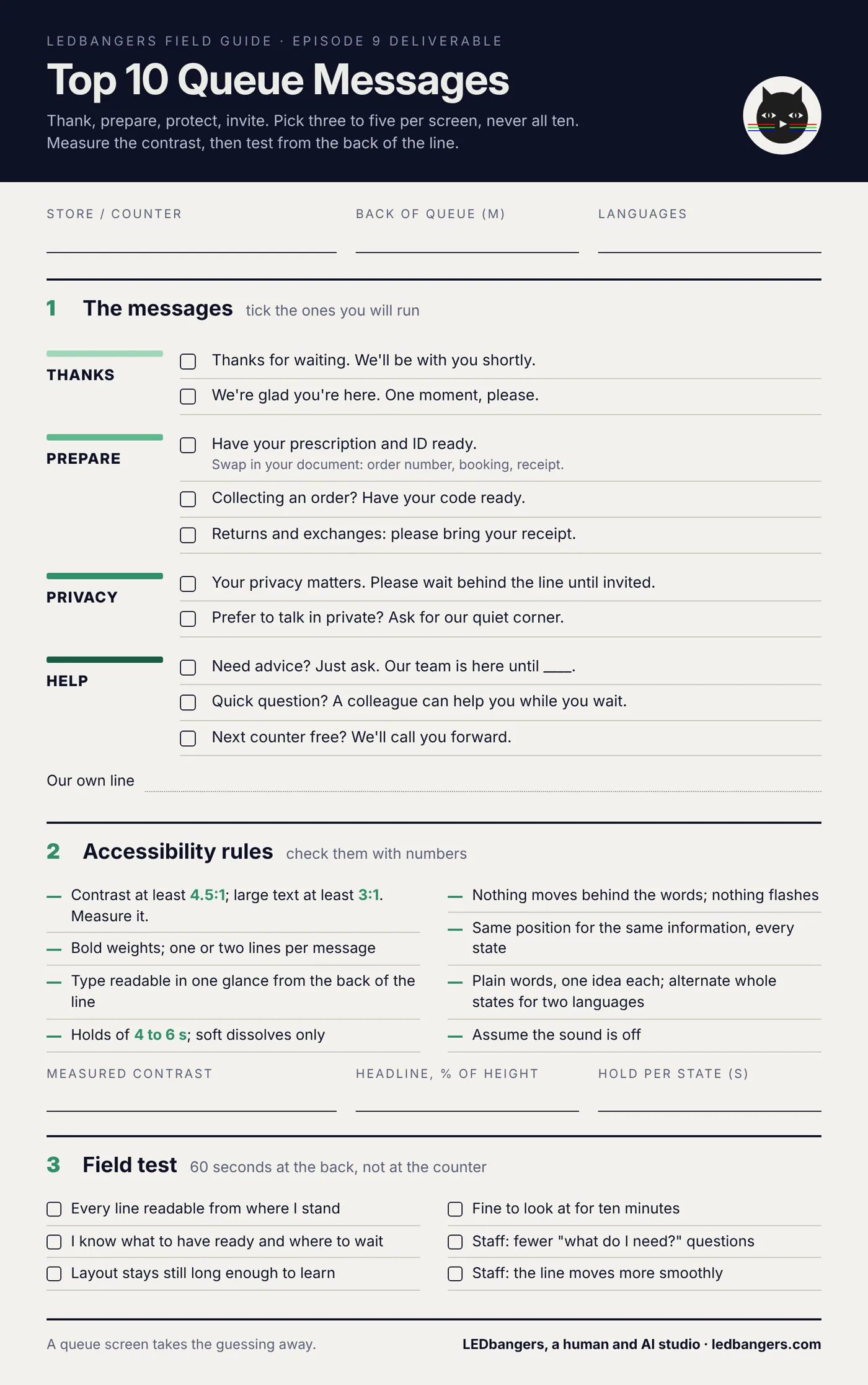
This episode's sheet is two things on one page: ten queue messages that work, grouped by the four jobs of the stack, and the accessibility rules with the numbers to check them against. Pick three to five messages per screen, never all ten.
The blank sheet is below. Save it and fill it in. If you want it written for your counter, start a brief at ledbangers.com.
One thing to keep
A queue screen should not sell the loudest. It should take the guessing away: thank, prepare, protect, invite.
Next episode
Episode 10, choosing the right screen: brightness, pixel pitch and viewing distance in plain English, so the hardware does not sabotage the content before it plays.
If you want the field guide as it ships, plus the deliverable from every episode, follow LEDbangers. If your queue screen is selling to people who are waiting, start a brief at ledbangers.com.
LEDbangers is a human and AI studio making code-first motion for retail LED and OLED screens. This episode was researched and written with AI, built on our own research base and on interviews with Burcin Inan Ozel, who reviewed and edited every line. The figures are made in the studio the same way. Poma and Luma are the two cats who argue in the margins: instinct and structure, the two halves of every good screen.
Sources: David Maister, The Psychology of Waiting Lines (in The Service Encounter, 1985); the Houston airport story from the New York Times (19 August 2012), reprinted by the Association for Psychological Science; contrast minimums, W3C WCAG 2.2, 1.4.3, which W3C's WCAG2ICT note applies to non-web screens.