Field Guide EP 03
The 5-second rule: how people read screens while walking
Season 1, Episode 3 of the retail screen field guide.
Watch the episodePDF: 5-second checklist
We're LEDbangers. If Episode 2 was about giving each screen a job, Episode 3 is the constraint that makes those jobs real.
Treat five seconds as your budget. Real looks are much shorter: in a 2015 eye-tracking study in a large London shopping centre, people looked at each display for about a third of a second on average.
Not five seconds of focused watching. Five seconds of fragmented attention: a glance, a half-glance, a return glance from a new angle, then gone. That's the environment. That's the medium.
If your screen needs commitment, it's designed for the wrong world.
A scene from the real timeline
A person passes your window. They're not bored. They're not "waiting to be entertained." They're navigating a city, a mall, a street. They're scanning for relevance.
They look at your screen for a fraction of a second.
In that fraction of a second, your screen either:
- communicates something meaningful, or
- becomes part of the noise floor of modern life.
Inside the store, it's the same. People don't "watch." They sample. They're walking, picking, comparing, searching, carrying, paying, asking. Attention is a scarce resource and your screen is competing with product and staff and reflection and daylight and the person's own internal errands.
That's why five seconds is generous.
What "five seconds" really means (the brutal version)
When we say "five seconds," we don't mean "they watch your loop for five seconds." We mean:
- they glance for a fraction of a second, rarely more than one or two
- they look away
- they glance again later
- often from a different angle
- often entering your loop mid-way
So the design question is not "how do we tell a story?" It's:
Can the screen communicate in one glance, and still reward repeat glances?
Retail reading is not linear. It's cumulative.
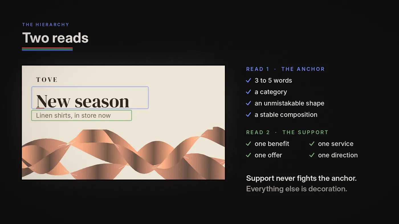
Two reads: the only hierarchy that matters
The five-second rule creates a simple hierarchy model. If you take nothing else from this post, take this:
Read 1 (instant): Anchor
The anchor is what lands in the first glance. It can be:
- a 3–5 word phrase
- a category label
- an unmistakable icon or silhouette
- a bold, stable composition
- a brand marker (not necessarily a logo stamp, more like a signature)
If the anchor doesn't land instantly, you've lost the moment.
Read 2 (optional): Support
Support is what becomes legible when someone gives you a little more time, or returns for a second glance. Support can be:
- one benefit
- one service
- one offer
- one directional cue
Support must never fight the anchor. Everything else is decoration.

Why TV logic fails here (again, but deeper)
TV and cinema are built on sequence: setup → tension → reveal → resolution.
Retail reading is built on fragments: glance → partial comprehension → repeat glance → cumulative meaning.
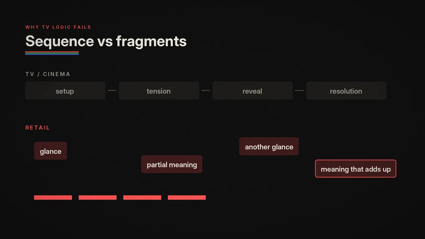
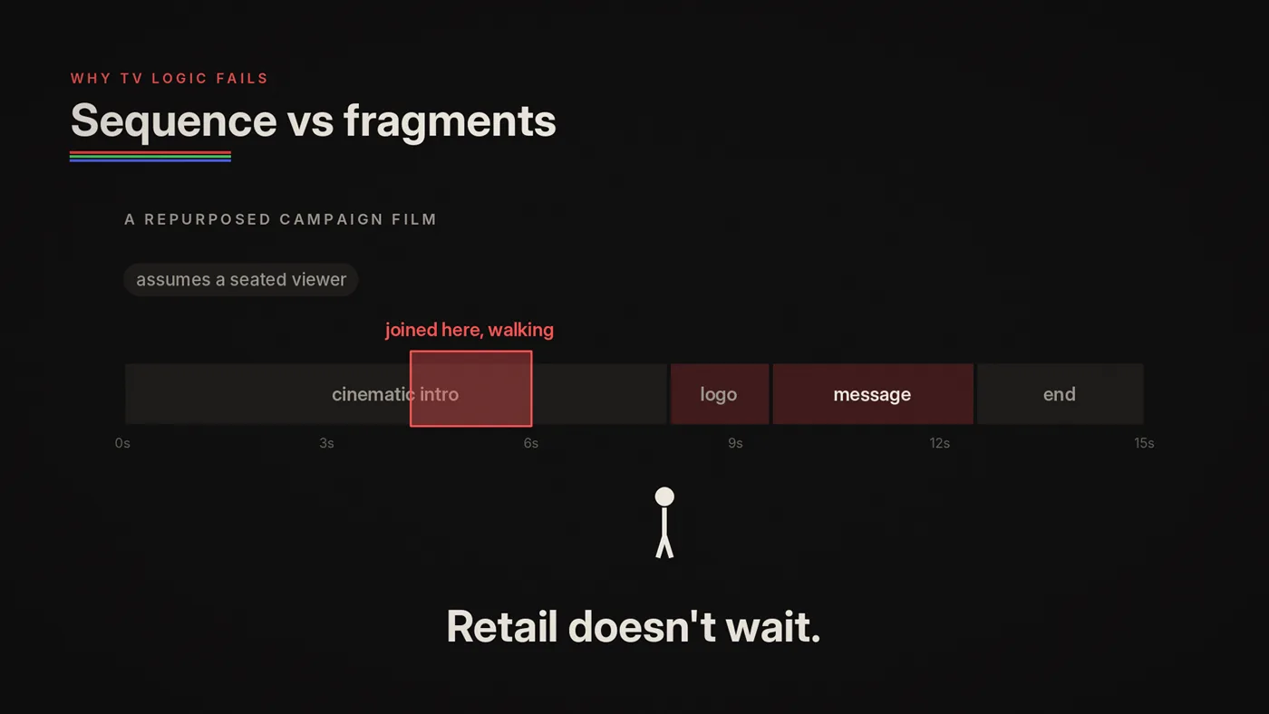
If your content depends on setup, it will fail. Because the viewer didn't start at the beginning. They joined in the middle of a loop while walking.
This is why "repurposed campaign videos" often fail on screens:
- the first frames are cinematic intros
- logos appear late
- the message arrives late, long after the first glance
- the pacing assumes a seated viewer
Retail doesn't wait.
The three types of screen moments (and which one you should use)
When designing for five seconds, screen content usually falls into one of these moments:
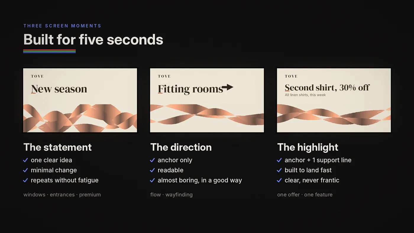
1) The statement
One clear idea. Minimal change. Repeats without fatigue.
- best for: windows, entry, premium spaces
- structure: anchor + texture, optional support
- tone: confident, calm
2) The direction
A stable instruction that helps movement.
- best for: wayfinding zones, entrances, service points
- structure: anchor only ("Checkout →")
- tone: stable, readable, almost boring (in a good way)
3) The highlight
One promotion or feature, designed to land quickly.
- best for: endcaps, interior promo walls, gentle checkout upsells
- structure: anchor (offer/feature) + support (detail)
- tone: clear, never frantic
Most networks fail because they try to do all three at the same time in one loop.
Words: how much text is too much?
Here's the rule we use before we even discuss typography:
One screen moment = one idea.
If you try to say two ideas in the same moment, you will say none.
Word count guideline
Our rule of thumb, close to the old billboard rule of about seven words:
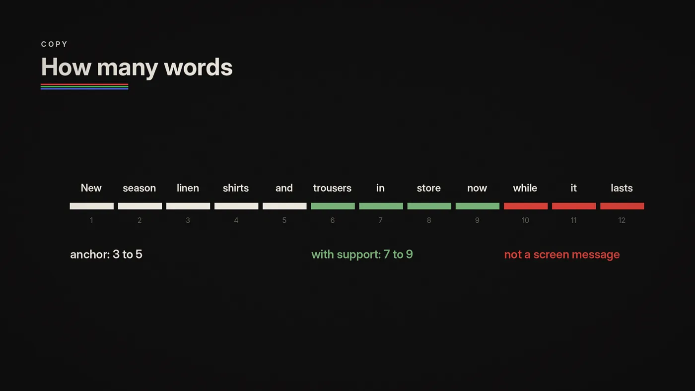
- 3–5 words is the sweet spot for the anchor
- up to 7–9 words total if you include support
- if you need more than that, it's probably not a screen message
Typeface matters as much as word count. In a 2014 MIT study of in-car screens, switching from a square grotesque to a humanist typeface cut the time men needed to look at the screen by 10.6%. Open, humanist letterforms read faster at a glance.
This doesn't mean "your brand can't be smart." It means:
Smart brands respect attention.
The hidden trap: tiny text because we must include it
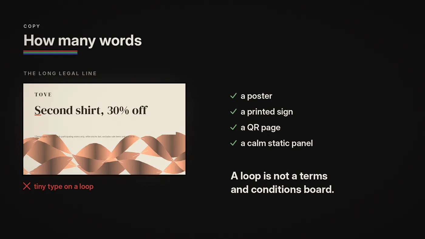
If a message is legally or operationally required and it's too long, don't hide it in tiny type on a loop. Move it to a poster, a printed sign, a QR-linked landing page, or a static info panel in a calmer zone.
A screen loop is not a terms-and-conditions board.
Motion: the fastest way to destroy readability
In a store, motion is bigger and brighter than on a laptop. What feels "cool" at a desk can feel like stress on the shop floor.
Motion should guide, not compete.
Motion is a pointer. It creates hierarchy. It gives rhythm. It should not become the subject.
Tempo should match zone
- Window: can be more energetic, but must still be readable while walking
- Interior: calmer, so it doesn't fight product
- Checkout/Queue: calmest, because people are already processing
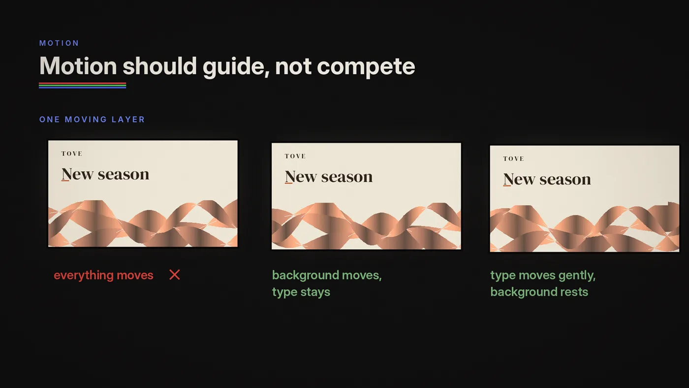
Avoid "everything moves"
If everything moves, nothing is readable. Choose one moving layer:
- background texture moves slowly
- typography stays stable
- or typography moves gently while background rests
- or very subtle movement in multiple layers, kept in sync
Transition discipline
Harsh cuts and rapid wipes often feel cheap on large LED. If you want premium repetition:
- use fades, dissolves, slow slides
- reduce the number of transitions
- prioritize stability
Entry-safe design: your loop must make sense anywhere
This is the rule most people ignore.
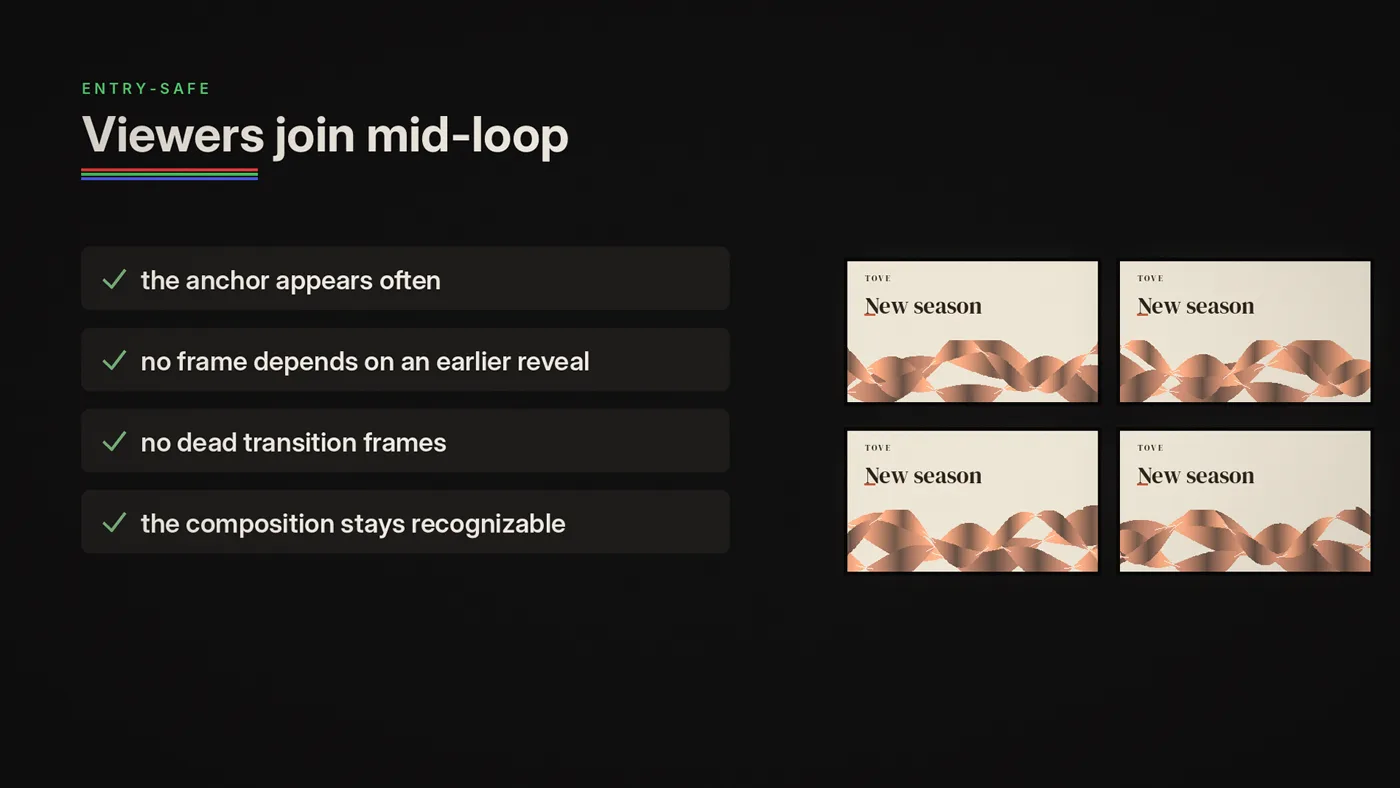
In retail, viewers join mid-loop. So the loop must be legible at random moments. We call this entry-safe.
A loop is entry-safe when:
- the anchor appears frequently
- frames don't depend on a previous reveal
- there are no "dead transition frames" that say nothing
- the composition stays recognizable even while changing
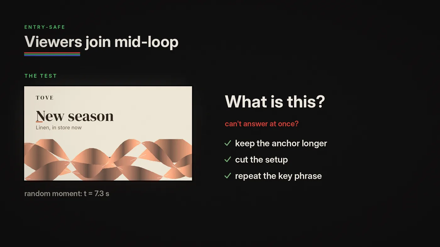
A simple entry-safe test
Look at the screen for one second at a random point in the loop. Ask yourself: what is this?
If you can't answer instantly, the loop fails entry-safe. Fix it by:
- keeping the anchor visible longer
- reducing "setup" time
- repeating the key phrase more often
- simplifying the layout changes
Repetition: the mechanism, not the punishment
People fear repetition because they confuse it with boredom.
Retail screens aren't supposed to entertain like a feed. They're supposed to work like dynamic signage with rhythm.
Repetition is how messages land when attention is fragmented. The trick is designed repetition:
- repeat the anchor
- vary texture subtly
- keep the system consistent
Think chorus, not spam.
Common failure modes (what you can spot in 10 seconds)
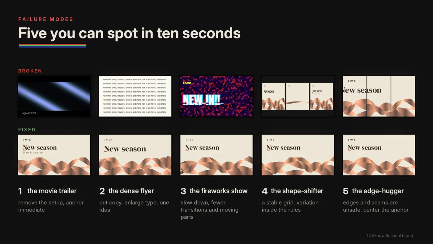
Failure 1: The screen is trying to be a movie trailer
Fix: remove setup, make the anchor immediate, design for mid-loop entry.
Failure 2: The screen is a dense flyer
Fix: cut copy, enlarge type, pick one idea, move details elsewhere.
Failure 3: The screen is a fireworks show
Fix: slow down. Reduce transitions. Choose fewer moving elements.
Failure 4: The screen changes layout constantly
Fix: keep a stable grid. Let variation live inside rules.
Failure 5: Critical information sits near edges or seams
Fix: keep critical content at least 5% in from every edge. Treat edges as unsafe. Center your anchor.
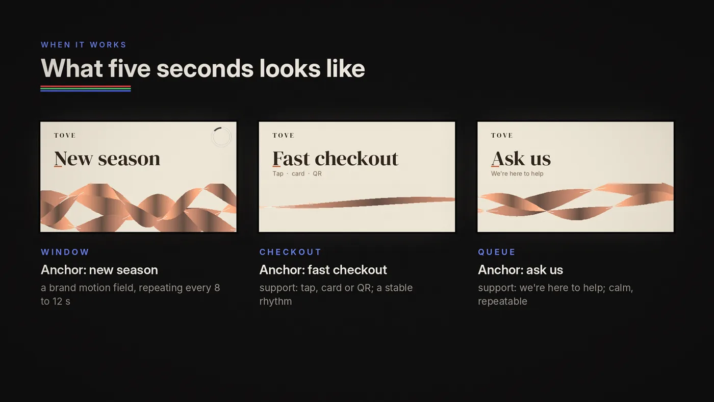
How to test the five-second rule in the real world
You don't need a lab. You need a routine.
Test A: Walk-by
Walk past the screen at normal pace. Can you read the anchor without slowing down? If not, increase size and reduce words.
Test B: Distance
View from real distances. Window: test at the sidewalk distance, often 3 to 10 metres. Interior: test at aisle distance, often 1.5 to 4 metres.
On LED, stand no closer than about 1 metre for every millimetre of pixel pitch, or you see dots instead of letters (Episode 10).
If it's only readable when you're close, it's not doing its job.
Test C: Angle
View from left/right extremes. If contrast collapses or type becomes thin, adjust weight and placement. Keep key content at least 5% in from every edge, and 8 to 10% on LED walls and bands (Episode 11).
Test D: Random entry
Glance for one second at a random moment. If it's unclear, it's not entry-safe.
Test E: Staff fatigue
Ask staff: "After an hour, does this feel annoying?" Staff are the early-warning system.
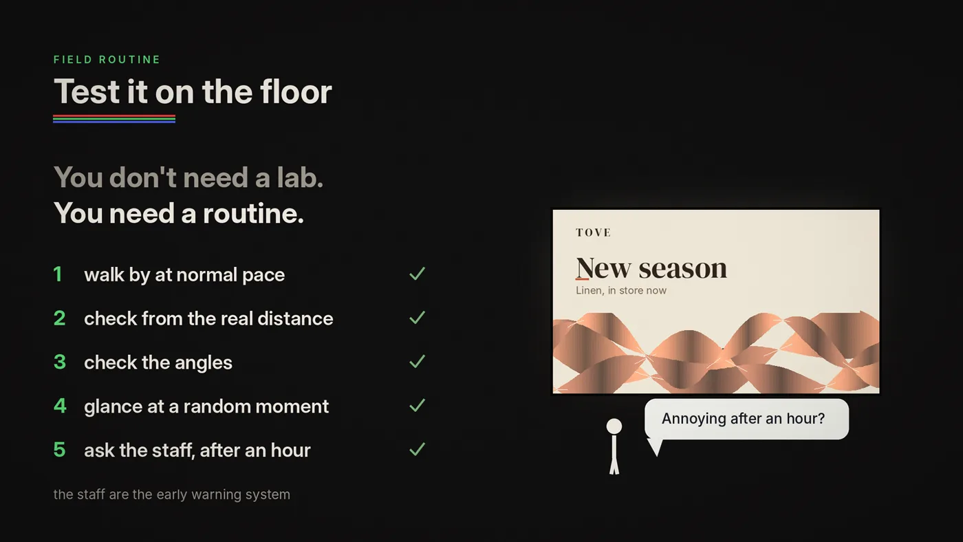
What five seconds looks like when it works
Window example (brand + category)
- Anchor: "NEW SEASON"
- Support: none or one short line
- Texture: brand motion field
- Rhythm: calm, repeat every 8–12 seconds
Checkout example (helpful conversion)
- Anchor: "FAST CHECKOUT"
- Support: "Tap / card / QR"
- Texture: subtle
- Rhythm: stable
Queue example (trust)
- Anchor: "ASK US"
- Support: "We're here to help"
- Texture: calm
- Rhythm: calm, legible, repeatable
Notice what's missing: long copy, complex storytelling, frantic transitions.
These examples can be endless, depending on the creative power of your marketing team and the identity of the brand. Here is a window LED content sample for a swimwear brand. Any anchor word could replace the placeholder, or a logo. Even with several layers of animation, the tempo is synced and sends the right signal.

The 5-second rule checklist
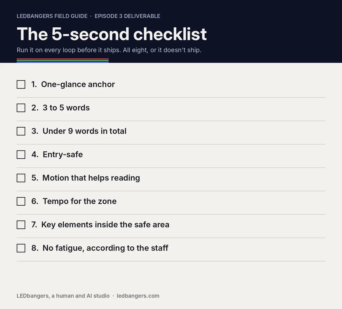
For each screen loop:
- Can the anchor be understood in one glance?
- Is the anchor 3–5 words (or a single symbol)?
- Is total text under 7–9 words?
- Is the loop entry-safe (random frame still makes sense)?
- Does motion support readability (not compete)?
- Is tempo appropriate for the zone (window/interior/checkout/queue)?
- Are key elements inside safe areas (not edges/seams)?
- Does it repeat without fatigue (ask staff)?
A small closing thought
Five seconds is not a limitation. It is the budget the medium gives you, and most looks use less of it.
If you design within it, screens stop acting like needy billboards and start acting like something better: calm, clear, consistent brand presence, something people absorb without being forced.
In the next episode, we'll go deeper into the natural format of retail screens: loops, why "seamless" beats "viral," how to design resets, and how to make content that can repeat all day without becoming noise.
Sources: Dalton, Collins and Marshall, "Display blindness? Looking again at the visibility of situated displays using eye tracking", CHI 2015; Huang, Koster and Borchers, "Overcoming assumptions and uncovering practices: when does the public really look at public displays?", Pervasive 2008; Reimer et al., "Assessing the impact of typeface design in a text-rich automotive user interface", Ergonomics 57(11), 2014; EBU R 95, Safe areas for 16:9 television production.